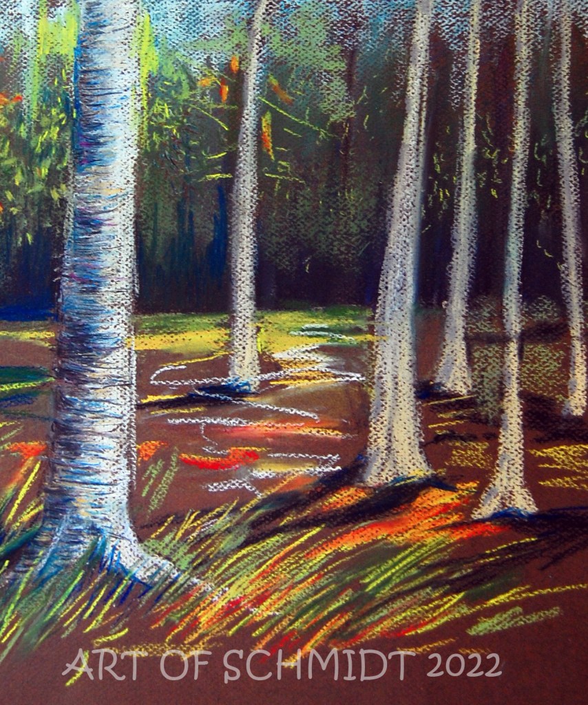
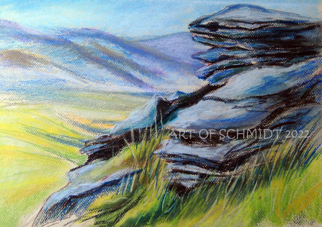
Today I am blogging about an introduction to the color wheel and how artists can use it to choose an effective color combination. Since last week, I have been consulting a reference book entitled, Color is Everything, by Dan Bartges. I wanted to try out some various color schemes for my Biographical Portrait of Sting, which I posted about in last week’s Sketchbook blog post. After consulting the book about possible color schemes, I tried out two versions of a tetrad color scheme; one is described on pg. 35, and consists of oranges, reds, and greens, while the other color combination includes blue-greens, red-oranges, yellow-oranges, and blue-violets and is described on page 36. But before I get into the definition of tetrad color schemes, I would like to give a short overview of the color wheel and how it can improve an artist’s artwork.


According to the article, “Color Psychology: The Emotional Effects of Colors”, retrieved from www. art therapy blog.com, the color wheel displays the three primary colors and its secondaries, and the twelve colors which are included on the color wheel are yellow, yellow-orange, orange, red-orange, red, red-violet, violet, blue-violet, blue, blue-green, green, and yellow-green. The most important colors displayed on the color wheel are red, yellow, and blue, from which you can mix almost any color. (ibid) However, this concept should be considered in a theoretical context, because paints do not necessarily contain only one color. (ibid) In fact, paints often contain traces of other colors which can affect the final outcome of color mixtures, towards a warmer or color tone of a specific color. (ibid) Some colors that you can mix from the two primaries include: yellow + red= orange and red + blue= violet.
According to the author, Bartges, a triadic color scheme utilizes three colors which are equidistant from each other on the color wheel, and these colors create “a strong, triangular relationship.” For example, a commonly used triadic scheme for landscapes includes: green, orange and violet. And the “most visually powerful triad is red, yellow and blue, which are called the primary colors. In my upcoming courses, I will be instigating color in a variety of media such as pastel, collage, watercolor, etc. Starting in April, I will be teaching several art courses where I will be exploring the concept of color in a variety of courses, such as: Landscapes in Pastel, The Four Seasons, and Drawing into Calm: A Mixed Media Survey Course, at the Delaplaine Art Center. To learn more, visit: https://delaplaine.org/. You can register for the classes on their website by going to the instruction link, and then going to the classes and workshops link. Thanks for stopping by!