New Art Class Forming this Fall!
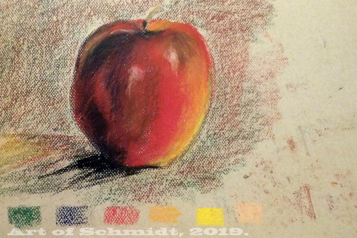
Today I am blogging about an introduction to the color wheel and how artists can use it to choose an effective color combination. Since last week, I have been consulting a reference book entitled, Color is Everything, by Dan Bartges. I wanted to try out some various color schemes for my Biographical Portrait of Sting, which I posted about in last week’s Sketchbook blog post. After consulting the book about possible color schemes, I tried out two versions of a tetrad color scheme; one is described on pg. 35, and consists of oranges, reds, and greens, while the other color combination includes blue-greens, red-oranges, yellow-oranges, and blue-violets and is described on page 36. But before I get into the definition of tetrad color schemes, I would like to give a short overview of the color wheel and how it can improve an artist’s artwork.


According to the article, “Color Psychology: The Emotional Effects of Colors”, retrieved from www. art therapy blog.com, the color wheel displays the three primary colors and its secondaries, and the twelve colors which are included on the color wheel are yellow, yellow-orange, orange, red-orange, red, red-violet, violet, blue-violet, blue, blue-green, green, and yellow-green. The most important colors displayed on the color wheel are red, yellow, and blue, from which you can mix almost any color. (ibid) However, this concept should be considered in a theoretical context, because paints do not necessarily contain only one color. (ibid) In fact, paints often contain traces of other colors which can affect the final outcome of color mixtures, towards a warmer or color tone of a specific color. (ibid) Some colors that you can mix from the two primaries include: yellow + red= orange and red + blue= violet.
According to the author, Bartges, a triadic color scheme utilizes three colors which are equidistant from each other on the color wheel, and these colors create “a strong, triangular relationship.” For example, a commonly used triadic scheme for landscapes includes: green, orange and violet. And the “most visually powerful triad is red, yellow and blue, which are called the primary colors. In my upcoming courses, I will be instigating color in a variety of media such as pastel, collage, watercolor, etc. Starting in April, I will be teaching several art courses where I will be exploring the concept of color in a variety of courses, such as: Landscapes in Pastel, The Four Seasons, and Drawing into Calm: A Mixed Media Survey Course, at the Delaplaine Art Center. To learn more, visit: https://delaplaine.org/. You can register for the classes on their website by going to the instruction link, and then going to the classes and workshops link. Thanks for stopping by!
This Winter I will be teaching art classes at two different locations! I am honored to join the staff at the Adams County Arts Council in Gettysburg, PA, and will be teaching two art courses there. Beginning in February, I will be offering a beginner’s pastel course that will guide you through the basics of value, shape, and color and teach you to paint in the style of the Impressionists. To learn more about this course, visit https://www.adamsarts.org/classes/.
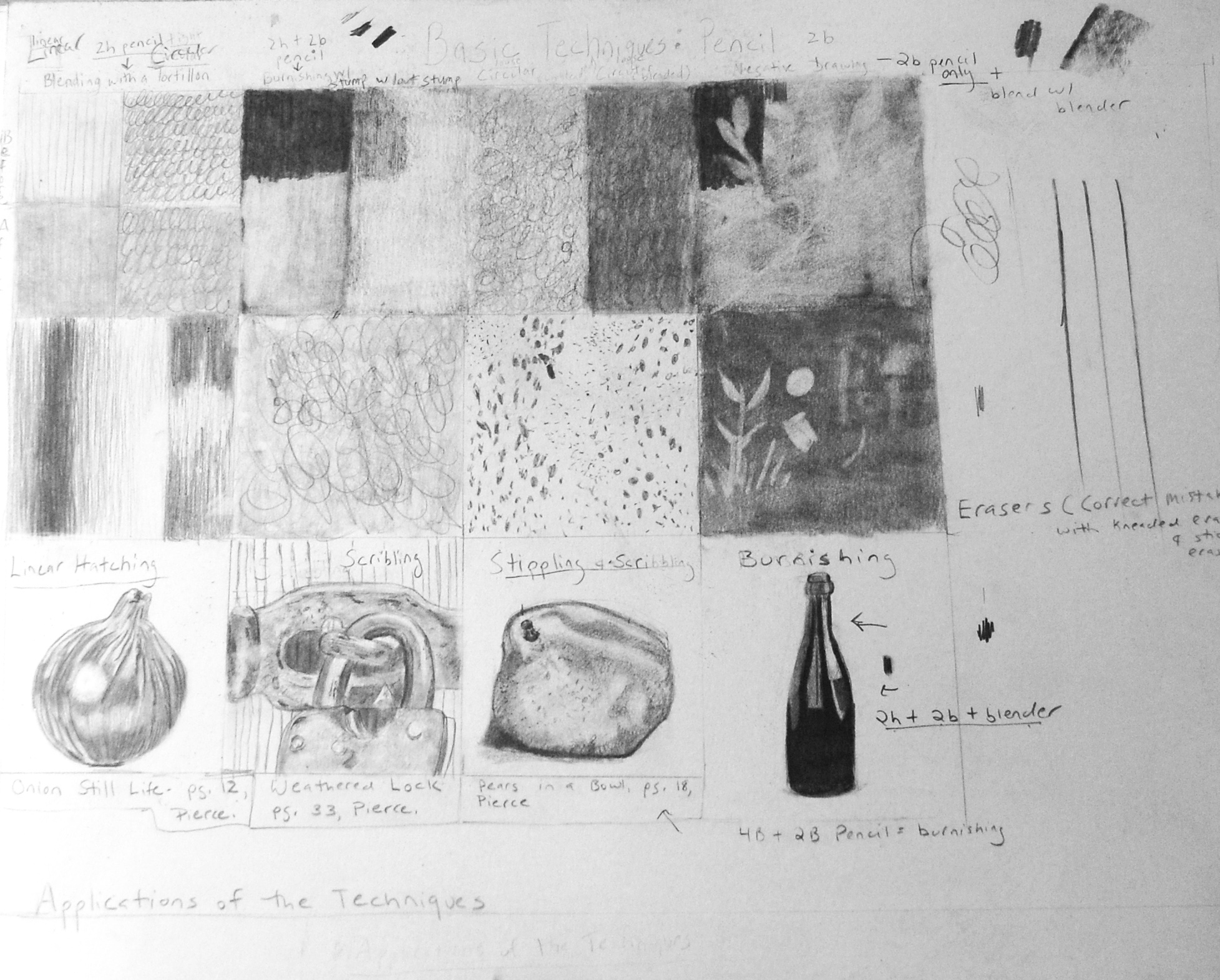
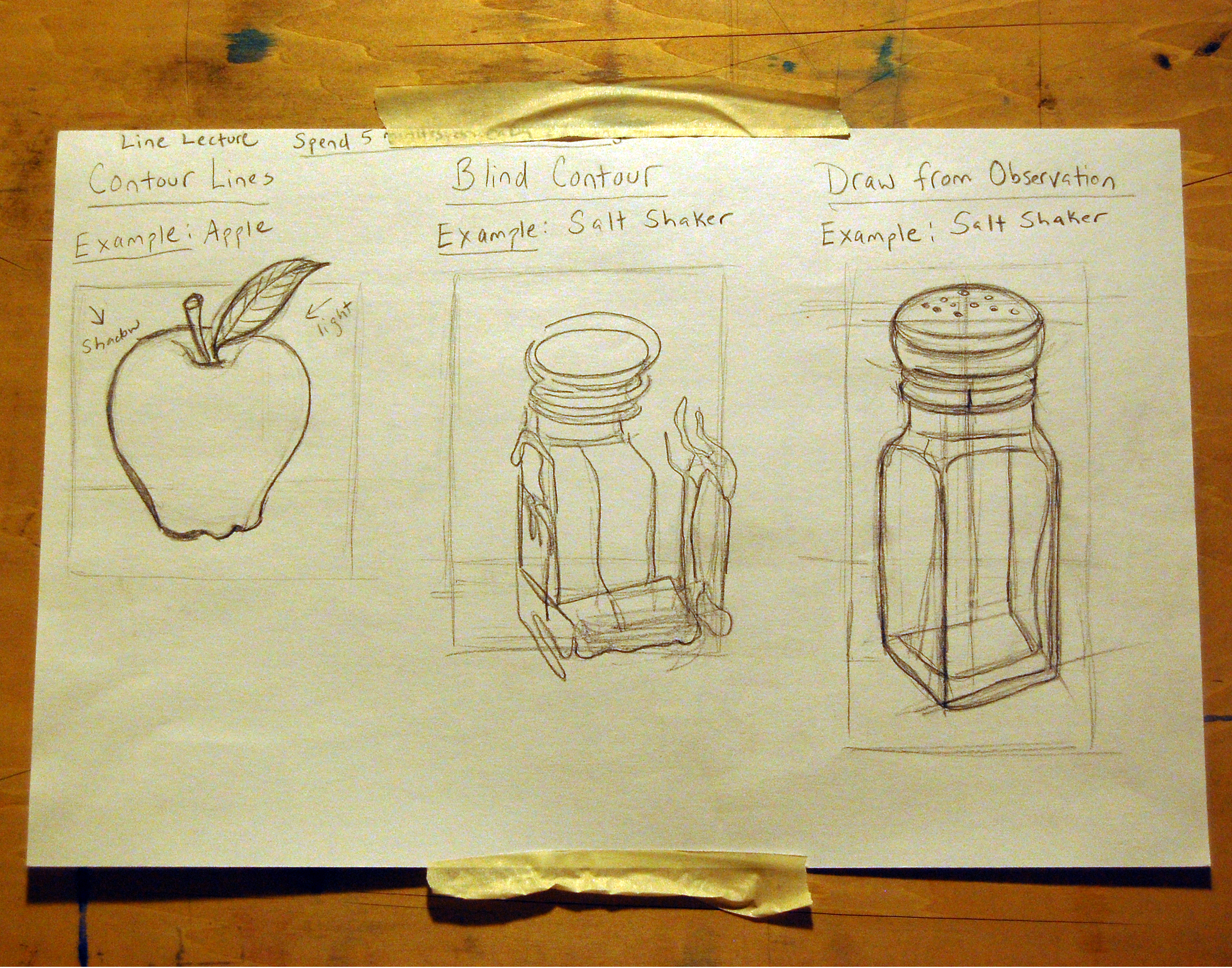
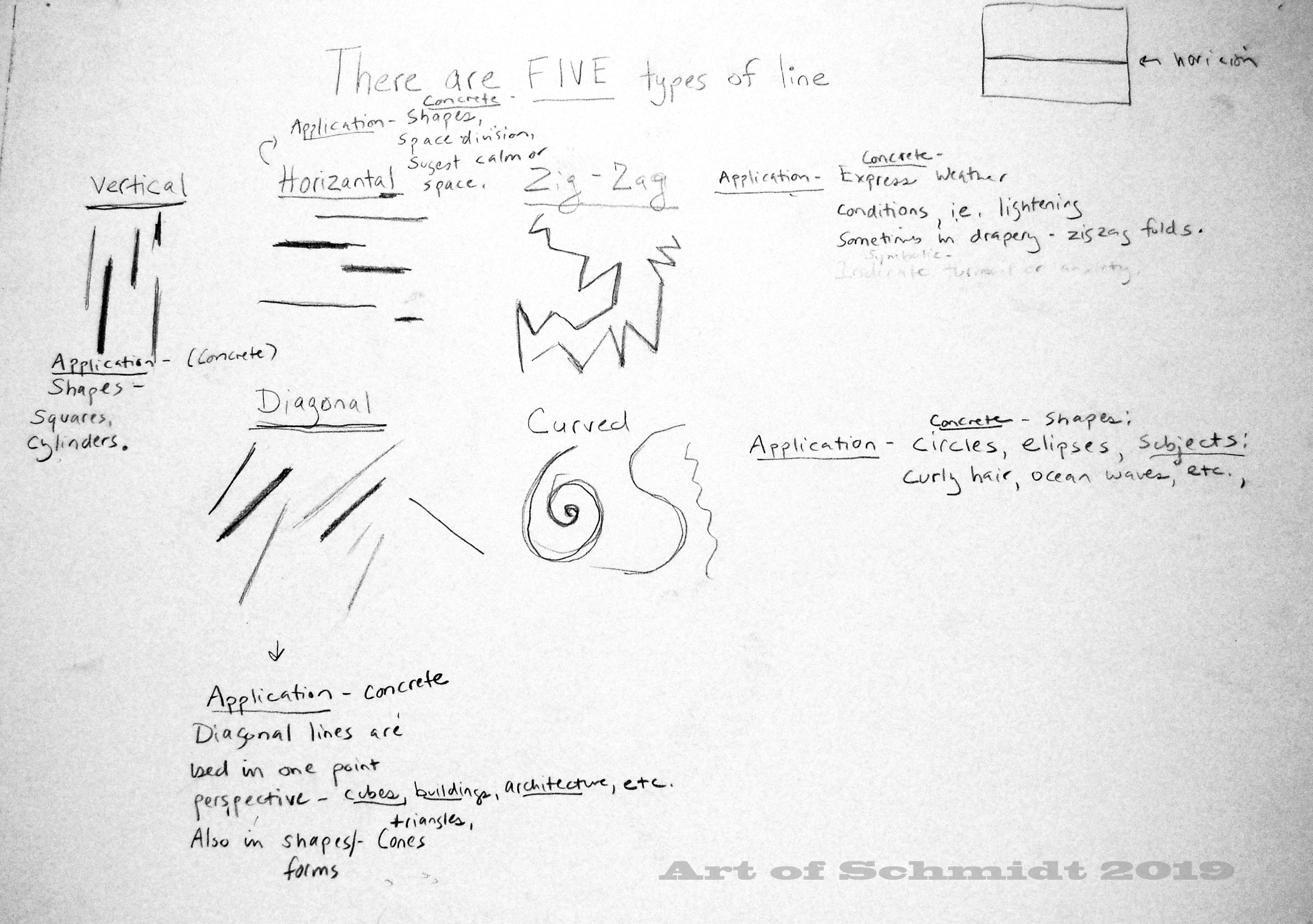
And in January I will be teaching a beginner’s course in drawing called, Classic Drawing at the Adams County Arts Council. If you have ever wanted to learn how to draw this is the course for you! Or, if you need a refresher in drawing fundamentals such as shading and building objects from simple shapes, this course will help you get back into the groove! Visit this link for more details: https://www.adamsarts.org/classes/.
I will also be teaching the beginner’s pastel course in February at the Delaplaine Art Center in Frederick, MD. To register or learn more about this course, visit this link: https://delaplaine.org/instruction/classes-workshops/.
Stay tuned for details about more art courses I will be offering at the Delaplaine Art Center this Spring! These courses include Pastels in Landscapes, and a mixed media course called Drawing Calm. Visit the Delaplaine Art Center website for updates!


Hello friends, fans, and family,
I will be hosting a pastel workshop at the Dublin Roasters coffee shop in Frederick, MD on September 22, 2018, from 1-3 pm. Here is a link to the website, in case you need directions: http://www.dublinroasterscoffee.com.
The cost per person is $25 and it includes a live demonstration about how to create a dramatic still life in pastels. Using a step by step approach, I will teach you how to create a masterpiece in pastels. All supplies for the class are provided by me, including pastels and paper. The subject will be a carafe and onions with chiaroscuro lighting similar to the old master, Rembrandt. Seating is limited so email me asap if you are interested. I will be reserving a small room in the back of the coffee shop, Room 1. To register, email me at jsjschmidt2@gmail.com. You can pay for the class the day of the event, by cash or check. Beginners are welcome! Come on down! 
Time seems to be getting away from me lately; working long hours at my part-time job, keeping my house clean and neat, cooking, running errands, etc. I’ve had precious little time lately to do art, or even to blog, or think much about the when/how/what, I want to blog about. My thoughts have been scattered like so many leaves on the wind, and my content ideas for this week’s blog post have ranged from marketing tips for artists to ideas for making time for art, and finally to the reason why artists need a portfolio. And I have come to the conclusion that I might have put the cart before the art because before artists can market their artwork, they need a substantial body of work to choose from with a concentrated theme and a style. However, before I get into a lot of detail about why artists need a portfolio to help market themselves to galleries, etc., I want to provide a definition of an artist’s portfolio. What is it? An artist’s portfolio is a visual reproduction of an artist’s work, often displayed as photo reproductions in a removable file folder, and other formats may include a printed book of an artist’s artwork, or a CD with jpeg images, or other formats such as online portfolio, “which showcases an artist’s style or method of work.” (Source: Wikipedia, “Artist’s Portfolio,” retrieved from https://en.wikipedia.org/wiki/Artist%27s), a portfolio can be used by artists to show employers and gallery owners the artist’s collection of best works, often limited to a specific medium and theme for clarity and cohesiveness (ibid).
To investigate this idea more fully, I did some research via my favorite source, the World Wide Web. According to an article entitled, “6 Things You Can Do To Promote Your Art”, by Agora Gallery staff, A compelling portfolio will help artists to create “branding and packaging.” (www.agora-gallery.com) In addition, a portfolio paves the way for artists to enter art competitions “post on their website,” and create marketing materials (ibid), such as brochures, business cards, fliers, etc. Furthermore, a crucial aspect of an artist’s portfolio is the “visual reproduction,” of an artist’s art, because the quality of your art reproductions, (ibid) whether it is in photographs or prints, will play a crucial role in capturing your potential fans and customers and turning them into followers. This is especially true of visual heavy sites such as Instagram and Pinterest.
High-quality photography is a must for an artist’s website, social media postings, portfolio, commerce shops or online galleries, etc… To stand out from the competition, Artists need their artwork to shine above all, not for their followers to focus on bad photographs, with fuzzy or blurred images that are dark and badly composed. These flaws will detract from an artist’s work. Although some experts will advise artists to hire professional photographers to exclusively document their work, I have a different take on this issue. I think artists should do whatever works best for them, rather than a hard and fast rule like this one. I know from personal experience that it can be difficult to afford the fees from professional photographers as an emerging artist. For example, one of the choices I have made in order to make time for art is to work part-time. There are both pluses and minuses of this life choice, and while it affords me additional time to work on art while I am at my best, (during early afternoon hours) it also limits the amount of money I have to spend on art supplies, marketing, etc. My solution for photography is to take my own photos and learn how to do this skillfully. If artists want to learn how to take their own photos, they can learn this skill through a variety of avenues, such as reading photography books from their library, taking photography classes at their local community colleges, and experimenting with different cameras, lighting, and tripods, etc. I also recommend an article called,” 4 Steps to Photographing Your Art”, by Art Archive, which can be retrieved at https://www.artworkarchive.com/blog/4-steps-to-photographing-your-art-like-a-professional.
If you can afford a professional photographer, by all means, do some research and seek out professional recommendations from trusted friends and family. But be sure the photographer in question has experience in taking photos of art. Here are some tips from Agora Gallery offers regarding the content of an artist’s portfolio: 1.) Use high-quality photos to document your art, 2.) Include a brief and compelling description of each artwork, include information such as: “size, title, media”. Also be sure to include a succinct description which describes the art. 3.) Tell a story about your art if you can, what inspired you to do the work, etc. 4.) Include a strong biography which describes your backstory as an artist, such as your journey as an artist, etc. (Source: Agora Gallery, “6 Things You Can Do To Promote Your Art”, retrieved from www.agora-gallery.com). Make sure it isn’t generic, and that it sets you apart from other artists. As you write your biography, think about the first page of your favorite book and why it moves you or grabs your attention and makes you want to turn the page to find out what happens next.
Please note that it is very important to limit the number of images that you include in your art portfolio and be sure that there is a consistency in style and theme, as part of your branding. (Source: “Artists: Are you Consistent? A Gallery Owner’s Perspective,” Jason Horejs, November 3, 2017, retrieved from http://reddotblog.com/artists-are-you-consistent-a-gallery-owners-perspective-3/). Do not attempt to include every item of artwork you have made in your portfolio. (ibid) Only include your best work. To narrow your focus, it might help you to write an artist’s statement, which describes the themes and context of your work and what makes it unique. To learn more about an artist statement, go to the following link: http://www.saic.edu/media/saic/pdfs/lifesaic/careerco-opcenter/workingartistsseries/Handout_WorkingArtist_WritingYourArtistStatement.pdf.
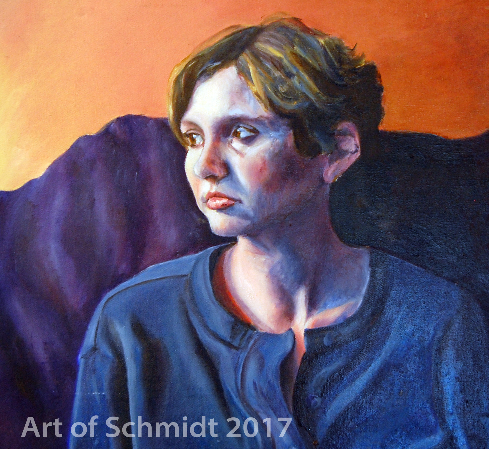
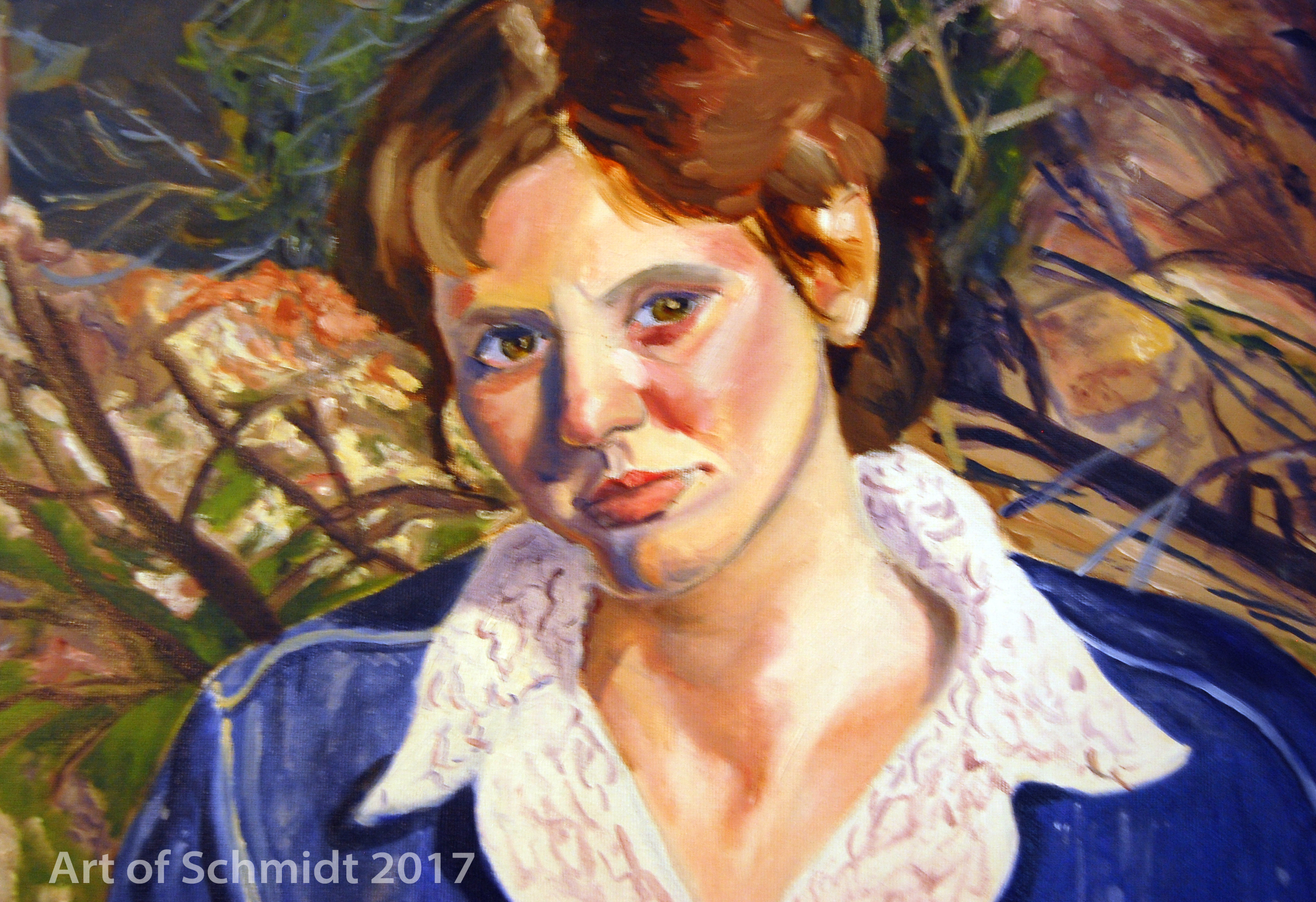
In this post, I have included some oil paintings I completed during my senior year at McDaniel College as part of my senior studio final project. These help explain the concept of consistency in style, subject matter, and medium, as they are all self-portraits, executed in oil paints in an impressionistic style. The theme of these works was to illustrate different feelings expressed in the lyrics of songwriter, Sting. Some of the songs that inspired these works are: Lithium Sunset, Secret Journey and Let Your Soul Be Your Pilot. Many of these songs express struggles with failure, depression, making choices, getting back up again and making sense of the world. Here is a brief lyric from Let Your Soul Be Your Pilot:
When you’re down and they’re counting
When your secrets all found out
When your troubles take to mounting
When the map you have leads you to doubt
When there’s no information
And the compass turns to nowhere that you know well
Let your soul be your pilot (Source: http://www.sting.com/discography/lyrics/lyric/song/176)
It is also important to do research about potential galleries you would like to exhibit your artwork before you send out your portfolio to galleries. For example, you might want to read their website and look at the work of artists that they already represent to get an idea of what style, mediums they gravitate towards, the gallery’s philosophy, etc. You might even want to make a drive to visit the gallery in person and meet the staff


if that is possible. This will give you an idea of what their customer service is like, and if you might mesh well with the gallery staff or not. Remember to be strategic about your choices for art competitions and gallery submissions, and look for opportunities that will be a good fit for your art.
Thanks for stopping by! I am planning to write about the topic of how artists can market their work as a series, to follow up this week’s post on why artists need a portfolio. Next week’s blog post will describe the concept of artist portfolios in more detail and all the different formats which are available.One final thought before I close, before you can make a portfolio, you must be putting in the hours in your studio and make art as much as possible, nights, weekends, etc. Also, it is important to invest time in learning and developing your specific medium of choice and style. This may not happen overnight and it takes time. After all, if you aren’t making art, you have nothing to promote.