
Tag: England
The Importance of Color in Art: Choosing a Color Scheme
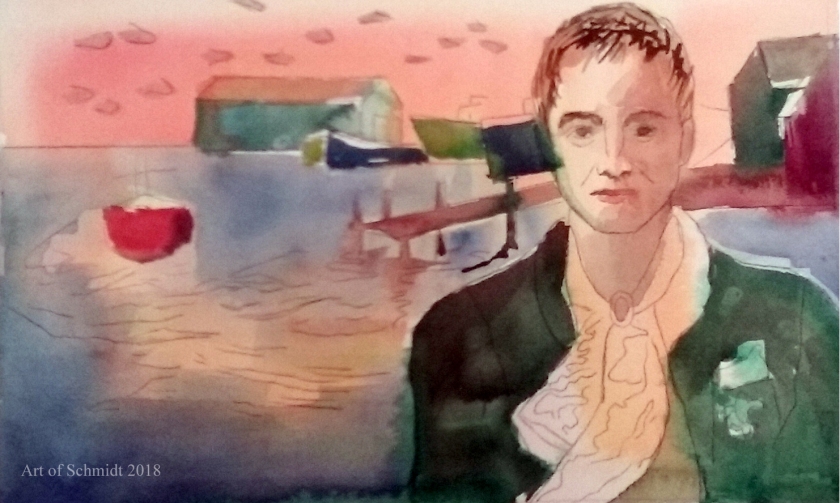
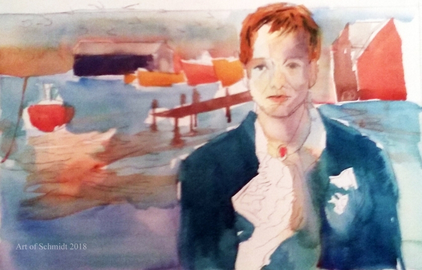
Today I am blogging about an introduction to the color wheel and how artists can use it to choose an effective color combination. Since last week, I have been consulting a reference book entitled, Color is Everything, by Dan Bartges. I wanted to try out some various color schemes for my Biographical Portrait of Sting, which I posted about in last week’s Sketchbook blog post. After consulting the book about possible color schemes, I tried out two versions of a tetrad color scheme; one is described on pg. 35, and consists of oranges, reds, and greens, while the other color combination includes blue-green, red-orange, yellow-orange, and blue-violet and is described on page 36 of Bartge’s book.

But before I get into the definition of tetrad color schemes, I would like to give a short overview of the color wheel and how it can improve an artist’s artwork.According to the article, “Color Psychology: The Emotional Effects of Colors”, retrieved from http://www.arttherapy blog.com, the color wheel displays the three primary colors and its secondaries, and the twelve colors which are included on the color wheel are: yellow, yellow-orange, orange, red-orange, red, red- violet, violet, blue-violet, blue, blue-green, green, and yellow-green. The most important colors displayed on the color wheel are red, yellow and blue, from which you can mix almost any color. (ibid) However, this concept should be considered in a theoretical context, because paints do not necessarily contain only one color. (ibid) In fact, paints often contain residues of other colors which can affect the final outcome of color mixtures (ibid). Some colors that you can mix from the two primaries include yellow + red= orange and red + blue= violet. These colors are called secondaries.(ibid) It’s interesting to read that primary colors theoretically mixed together, can create any color you wish, but that in practice, it is not always so easy. I think that this is a concept I have grasped as a seasoned painter but did not have words to explain it. This is why I need to buy specific cool reds such as alizarin crimson, or warm reds, such as carmine to get reddish colors that are either warm or cool in tone. Now I have evidence to support my observation and I can explain to others why I need to buy so many different paint colors to create specific colors!
According to the author, Bartges, (2008), a triadic color scheme utilizes three colors which are equidistant from each other on the color wheel, and these colors create “a strong, triangular relationship.” For example, Bartges, 2008, states that a frequently utilized triadic scheme for landscapes includes green, orange and violet. Furthermore, in the words of Bartges, 2008, the “most visually powerful triad is red, yellow and blue, which are called the primary colors”.
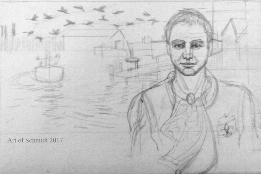
I decided to apply this knowledge about triadic colors to my portrait of Sting. While I knew I wanted the colors to be pleasing to the eye, I didn’t want them to take center stage. Instead, I wanted them to complement the symbolic nature of the artwork. In this drawing, I wanted to tell a story about Sting’s ancestry and family stories, which I learned about by watching a PBS tv show entitled, Finding Your Roots, a few weeks ago. In this drawing, Biographical Portrait of Sting, I wanted to tell a story about Sting’s ancestry and family stories with references to his great-grandparent’s trade as lace makers, their migration to France, and to describe the setting of his hometown in Newcastle, England. These items were symbolized by the Canada geese migrating in the background, the lace handkerchief, the fleur de lis symbol, (which is often associated with French royalty, according to Britannica.com), and the ships and dock of the Tyneside docks represent the setting where Sting grew up amongst the shipbuilding trade in the 1950s. If you are interested, you can learn more about Sting’s family story by visiting the following website: http://www.pbs.org/wnet/gperf/blog/stings-roots-beyond-england/. The PBS website includes an overview of the television series, Roots, Finding your roots, which features an episode that investigates the family history of Sting, Sally Field, and Deepak Chopra. Thanks for stopping by! I hope to continue work on the color sketches pictured here and post the results on next week’s blog post.
