Surviving and Thriving in a Creative Desert

Things I have tried to do to get creative again

As I mentioned in last week’s post, I have been struggling with artist’s block this summer. During this journey, I’ve tried various things to break out of it, such as: copying art demonstrations from art technique books, re-touching/re-working old paintings, and working in a prompt driven sketchbook. Unfortunately, the later project hasn’t been working out so great lately. I’ve been procrastinating on doing the daily prompts, and have felt uncertain as to which mediums to work in for the sketchbook pages, should it be watercolor, colored pencil, acrylic, gouache or something else that I use? I have been unhappy with the colored pencils because they take so long to build up color and tone and I want to get some momentum and finish the nature section so I can keep moving along. It’s also difficult to correct mistakes with this medium, and I am finding that a lot of my prompts are not living up to my expectations. All of which keeps me stuck in neutral, and not making new work consistently.

Some insights I have gained about my artist’s block

Maybe it’s also the heat of the summer, which seems extraordinarily hot, even for Maryland. Or perhaps it’s the dislocation I feel in adjusting to a new house, guilt (genuine or otherwise, about abandoning household chores to make time for art), or something else entirely. Whatever the cause, I want to come up with some solutions so I can move forward and make more art, and hopefully at least some of the pieces will turn out the way I envision or will be at least good enough to post on social media. This year there’s been a mix of both good paintings and some not so good paintings. The paintings I’m not happy with might get thrown out, or sanded and re-worked, depending on the state of the canvases. I feel dry and uninspired, and I feel I have reached the limit of my skill set in art. In fact, I feel I need more fuel for my creativity and knowledge base.

Tips for breaking through a creative block

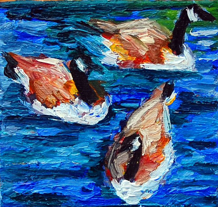
While I am pondering these thoughts, I’d like to share some tips I picked up from an article, “How to Survive a Creative Slump,” by Our Daily Craft, on http://www.ourdailycraft.com/2017/02/21/survive-creative-slump, by Sarah White, February 21, 2017. A few suggestions that the author offers include: 1.) starting with a small creative project, 2.) working quickly, 3.) reading a book you enjoy, and 4.) organizing or cleaning something in your home.  For instance, the author suggested a few small projects to help jumpstart your creativity such as 1.) “sewing a cloth napkin,” 2.) “knitting a headband,” 3.) Paint on a 4 x 4-inch surface, or “writing a haiku.” (Source: ibid)  Since I am not particularly good at crafts or anything DIY, which I learned after re-finishing some furniture and all of my kitchen cabinets in my new home, I have settled on painting a 4 x 4-inch canvas of Canada Geese. I re-worked this miniature canvas in oil paints about a week ago, and I am fairly happy with the result. Another suggestion that the author makes is to re-visit old projects that you had left unfinished. (Source: ibid)  I certainly have a pile of unfinished works-such as unfinished drawings, pastels, and pages in my sketchbook where things just didn’t come together. Perhaps it would be a good problem-solving exercise to utilize my creativity.

In addition, the author also discussed making something quickly-which I’m not sure I would do

3f9b42931a94480466da08e7886286ec--kid-quotes-writing-quotes
This quote was obtained from the internet via a Google search, and no copyright infringement is intended.
Canada Goose trio,flat
Canada Geese Trio, oil on canvas, 4 x 4 inches, 2018, Jodie Schmidt.
Koi fish painting, flat
Koi Fish Group, acrylic on canvas, 5 x 7 inches, 2018, Jodie Schmidt. This is the first stage of this painting.
Koi group, flat
Koi Fish Group, acrylic on canvas, 5 x 7 inches, 2018, Jodie Schmidt. And this is the completed acrylic painting! 
Koi fish portrait, flat
Koi Fish portrait, acrylic, 4 x 6 inches, 2018, Jodie Schmidt. Pictured is stage 1 of this acrylic painting.
works in progress, flat
Here are some small value paintings of water lilies and a blank canvas. I’m not sure what the subject might be for this one yet.
small value paintings, flat
Close up of the water lily paintings in progress.
nature sketches 1, flat
Pictured is stage 1 of my dandelion sketches in colored pencil and pastel. I wasn’t happy with how these turned out, so I re-worked them in two subsequent stages, pictured here. These drawings are from my Julia Orkin-Lewis Sketchbook, Draw Every Day, Draw Every Way. 
Nature sketches, 2, flat
My first step to re-work these paintings was to cover up the areas I didn’t like with gesso and let it dry so I could re-paint with acrylic. I learned that colored pencil is really hard to get rid of if you make a mistake.
dandelions sketchbook flat
And my final two steps were to add another layer of gesso after the first layer had dried. Afterward, I re-painted the offending areas with Liquitex acrylic paint. However, I’m still not sure if I am happy with these sketches, but I don’t want to get stuck on them either. They are, after all, supposed to serve as ideas for completed future paintings.

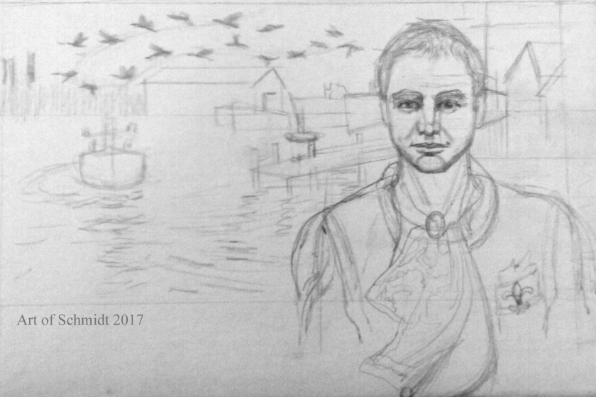
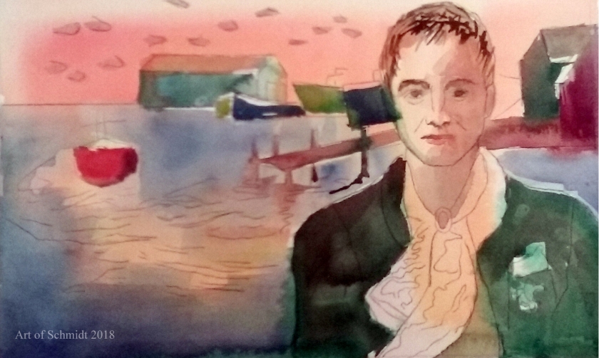
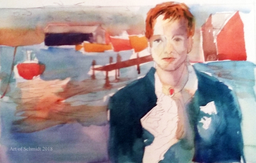
since most of the problems I have had with my art have been poor planning. Another problem which leads to unsatisfactory art for me is not spending enough time checking the accuracy of the drawing, as unfortunately happened with my latest portrait of Lincoln, which I decided to re-work and re-draw with oil paints. Needless to say, it didn’t turn out that well. Maybe if I were an abstract painter I could get away with a more intuitive approach to painting, than a more structured one with specific steps, but I am not. Since I am a more traditional painter, I am sticking with what works for me, which is starting with a drawing, adding three values in pencil to the sketch, and then making a colored sketch to base the final painting upon. Unfortunately, the more I tried to fix the drawing, the worse it got. In the end, I finally decided to abandon it, and start with a new sketch on a totally different substrate on a larger scale. It hasn’t become a painting yet, but I think I identified some drawing errors in the painting, by making a new sketch.

However, one thing I do want to try is to read a novel, article, or poem, to try and get some new ideas flowing. Some of my best works have been inspired by the poetry of Dickinson and Frost. Maybe reading literature will also help me to become a better writer and get me out o this writer’s block I seem to be assailed with lately. How about you? Do you have any suggestions for breaking out of a creative rut? I’d love to hear! Just post in the comments section of this blog. Thanks for stopping by!


ATC, artist trading card inspired Art, Canada Goose trio

Hello friends, family, and fans,

I am working on a new series of art inspired by the artist trading cards movement in which artwork is created on a 2.5 x 3.5-inch canvas or paper substrate. I’m hopeful that working more often will help me to improve my painting skills and help me to jump start my creativity again. The paintings will be based on photos I have taken and drawings in my sketchbook, Draw Every Day, Draw Every Way, by Julia Orkin-Lewis.  My new painting is called, Canada Goose trio and was painted with artist quality oil paints on cotton duck canvas. I started this painting several months ago but stopped when I got to a part I didn’t know how to finish. The painting was inspired by a trip I took to a favorite local park, called Hagerstown Community Park. There is an abundance of wildlife there, including Canada Geese, Swans, and Mallard Ducks. A large lake encircles the art gallery in front of the park, called the Washington County Museum of Art.  This newest painting is now available on my Etsy site for sale at https://www.etsy.com/shop/ArtofSchmidt.

Canada Geese trio, miniature, flat
Canada Geese Trio, oil on canvas, 4 x 4 inches, Jodie Schmidt, 2018. 

The Importance of Color in Art: Choosing a Color Scheme

Today I am blogging about an introduction to the color wheel and how artists can use it to choose an effective color combination. Since last week, I have been consulting a reference book entitled, Color is Everything, by Dan Bartges. I wanted to try out some various color schemes for my Biographical Portrait of Sting, which I posted about in last week’s Sketchbook blog post.  After consulting the book about possible color schemes, I tried out two versions of a tetrad color scheme; one is described on pg. 35, and consists of oranges, reds, and greens, while the other color combination includes blue-green, red-orange, yellow-orange, and blue-violet and is described on page 36 of Bartge’s book.

Sting, pencil sketch
Line sketch based on the Photoshop collage.
Sting in Landscape, with symbols, with black and white
Photoshop collage I made with various photographs.
Sting's Biographical Portrait #1, flat
Here is version one of my color sketch, using a tetrad color scheme of blue, orange, red and green. This sketch was made with watercolor and pencil.
Sting's Biographical portrait version #2, flat
This is version two of the color sketch tetrad version # 2, with blue-green, red-orange, and yellow-orange. The sketch was made with watercolor and pencil

But before I get into the definition of tetrad color schemes, I would like to give a short overview of the color wheel and how it can improve an artist’s artwork.According to the article, “Color Psychology: The Emotional Effects of Colors”, retrieved from http://www.arttherapy blog.com, the color wheel displays the three primary colors and its secondaries, and the twelve colors which are included on the color wheel are: yellow, yellow-orange, orange, red-orange, red, red- violet, violet, blue-violet, blue, blue-green, green, and yellow-green. The most important colors displayed on the color wheel are red, yellow and blue, from which you can mix almost any color. (ibid) However, this concept should be considered in a theoretical context, because paints do not necessarily contain only one color. (ibid) In fact, paints often contain residues of other colors which can affect the final outcome of color mixtures (ibid).  Some colors that you can mix from the two primaries include yellow + red= orange and red + blue= violet.  These colors are called secondaries.(ibid)  It’s interesting to read that primary colors theoretically mixed together, can create any color you wish, but that in practice, it is not always so easy. I think that this is a concept I have grasped as a seasoned painter but did not have words to explain it. This is why I need to buy specific cool reds such as alizarin crimson, or warm reds, such as carmine to get reddish colors that are either warm or cool in tone. Now I have evidence to support my observation and I can explain to others why I need to buy so many different paint colors to create specific colors!

According to the author, Bartges, (2008), a triadic color scheme utilizes three colors which are equidistant from each other on the color wheel, and these colors create “a strong, triangular relationship.” For example, Bartges, 2008, states that a frequently utilized triadic scheme for landscapes includes green, orange and violet. Furthermore, in the words of  Bartges, 2008,  the “most visually powerful triad is red, yellow and blue, which are called the primary colors”.

I decided to apply this knowledge about triadic colors to my portrait of Sting. While I knew I wanted the colors to be pleasing to the eye, I didn’t want them to take center stage. Instead, I wanted them to complement the symbolic nature of the artwork. In this drawing, I wanted to tell a story about Sting’s ancestry and family stories, which I learned about by watching a PBS tv show entitled, Finding Your Roots, a few weeks ago. In this drawing, Biographical Portrait of Sting, I wanted to tell a story about Sting’s ancestry and family stories with references to his great-grandparent’s trade as lace makers, their migration to France, and to describe the setting of his hometown in Newcastle, England. These items were symbolized by the Canada geese migrating in the background, the lace handkerchief, the fleur de lis symbol, (which is often associated with French royalty, according to Britannica.com), and the ships and dock of the Tyneside docks represent the setting where Sting grew up amongst the shipbuilding trade in the 1950s. If you are interested, you can learn more about Sting’s family story by visiting the following website: http://www.pbs.org/wnet/gperf/blog/stings-roots-beyond-england/. The PBS website includes an overview of the television series, Roots, Finding your roots,   which features an episode that investigates the family history of Sting, Sally Field, and Deepak Chopra. Thanks for stopping by! I hope to continue work on the color sketches pictured here and post the results on next week’s blog post.