Please be aware that I am no longer offering custom art services. If you are interested in purchasing my art work, a limited supply of prints, mugs, etc. is available through my website Red Bubble: www.redbubble.com/people/jsjschmidt2017.
While its been fun to work on client art, I want to focus more on illustrating my personal vision in my artwork expressing my own thoughts and feelings. I very occasionally post on Facebook or Instagram from my sketchbook.
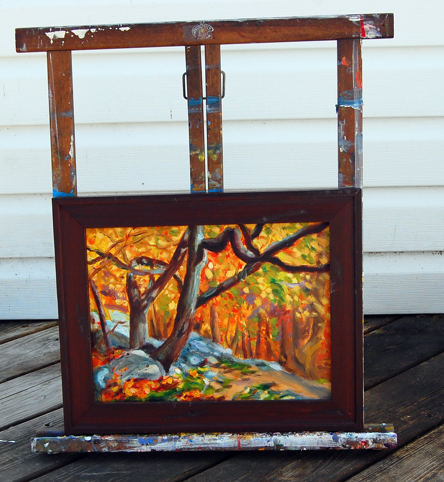
Catoctin Park 1, oil on canvas, 9 x 12 inches, 2013, Jodie Schmidt.
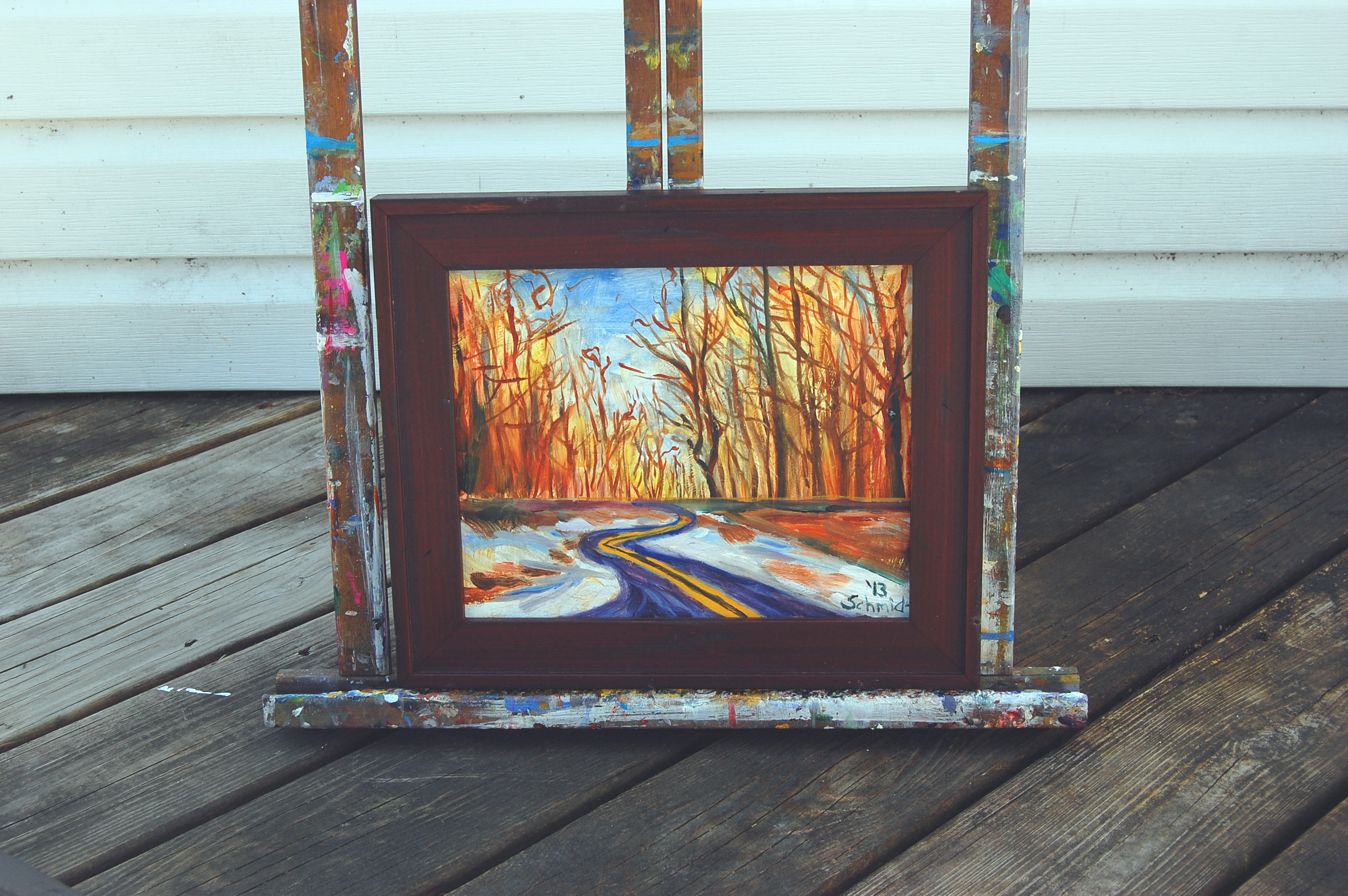
Catoctin Road at Sunrise, oil on canvas, 9 x 12 inches, 2013, Jodie Schmidt.
and followers,
Its been a while since I have posted since I have been waiting for some new news to share with you. My artwork will be displayed at the GWC Gallery for the month of October as part of a No Theme Show. Gloria is a new gallery owner who is working on helping new artists to have a space to exhibit their art. Come on down and visit! Here is a link to her website: https://www.gwc-artwork.com/. These are some of my oil paintings on display at the gallery. They feature scenes from beautiful Catoctin State Park, based on photos I took during the autumn. The paintings are custom framed with a beautiful wood frame, so they are all ready to hang on your wall!
Today I am blogging about an introduction to the color wheel and how artists can use it to choose an effective color combination. Since last week, I have been consulting a reference book entitled, Color is Everything, by Dan Bartges. I wanted to try out some various color schemes for my Biographical Portrait of Sting, which I posted about in last week’s Sketchbook blog post. After consulting the book about possible color schemes, I tried out two versions of a tetrad color scheme; one is described on pg. 35, and consists of oranges, reds, and greens, while the other color combination includes blue-green, red-orange, yellow-orange, and blue-violet and is described on page 36 of Bartge’s book.
Line sketch based on the Photoshop collage.
Photoshop collage I made with various photographs.
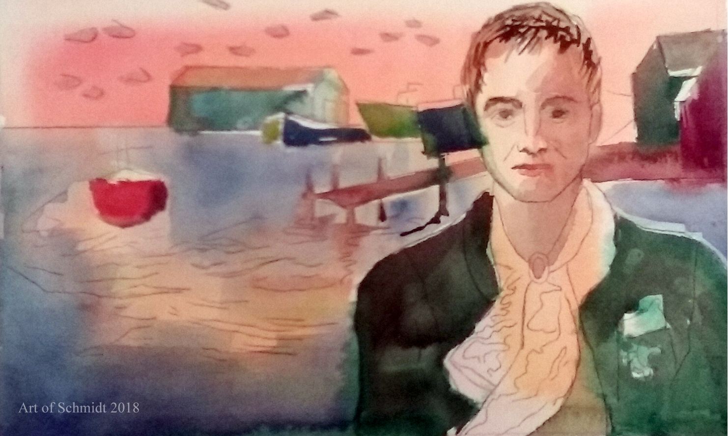
Here is version one of my color sketch, using a tetrad color scheme of blue, orange, red and green. This sketch was made with watercolor and pencil.
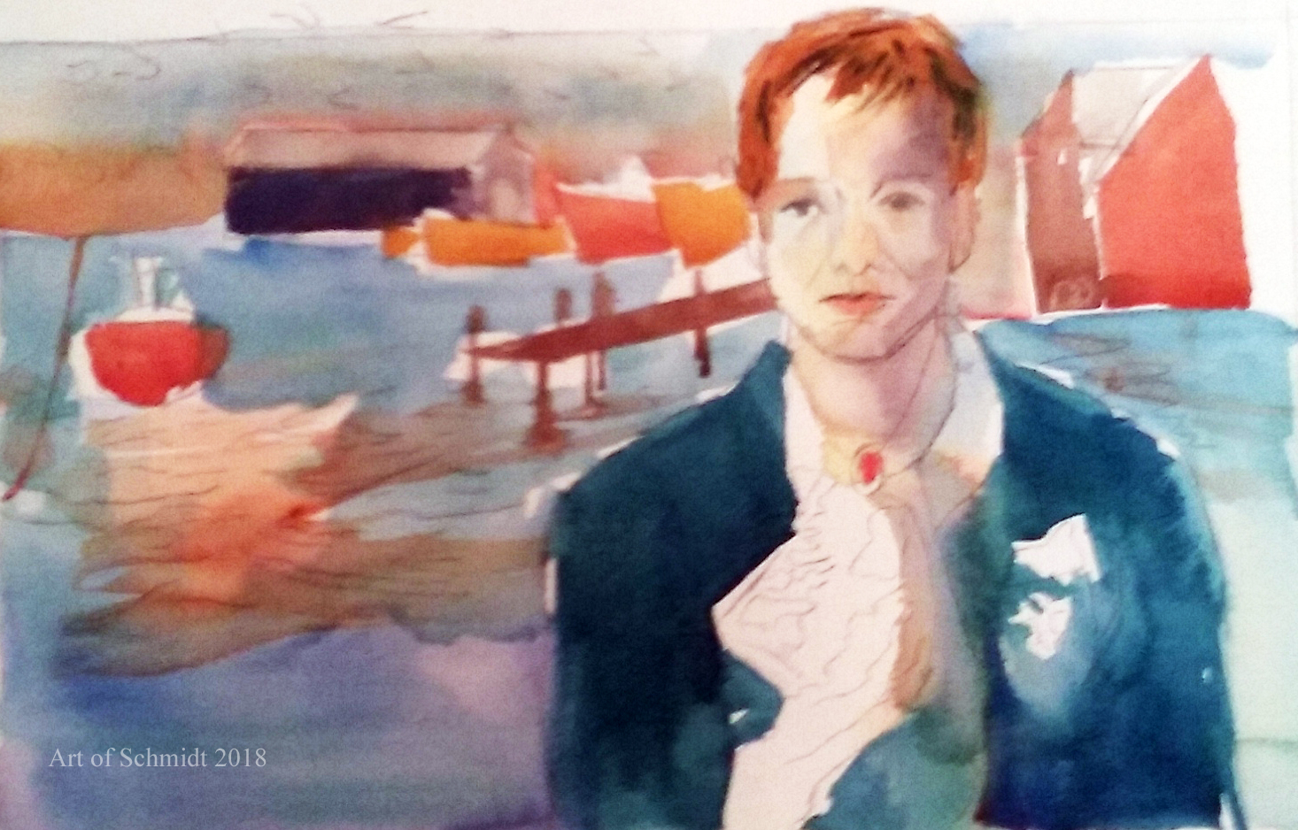
This is version two of the color sketch tetrad version # 2, with blue-green, red-orange, and yellow-orange. The sketch was made with watercolor and pencil
But before I get into the definition of tetrad color schemes, I would like to give a short overview of the color wheel and how it can improve an artist’s artwork.According to the article, “Color Psychology: The Emotional Effects of Colors”, retrieved from http://www.arttherapy blog.com, the color wheel displays the three primary colors and its secondaries, and the twelve colors which are included on the color wheel are: yellow, yellow-orange, orange, red-orange, red, red- violet, violet, blue-violet, blue, blue-green, green, and yellow-green. The most important colors displayed on the color wheel are red, yellow and blue, from which you can mix almost any color. (ibid) However, this concept should be considered in a theoretical context, because paints do not necessarily contain only one color. (ibid) In fact, paints often contain residues of other colors which can affect the final outcome of color mixtures (ibid). Some colors that you can mix from the two primaries include yellow + red= orange and red + blue= violet. These colors are called secondaries.(ibid) It’s interesting to read that primary colors theoretically mixed together, can create any color you wish, but that in practice, it is not always so easy. I think that this is a concept I have grasped as a seasoned painter but did not have words to explain it. This is why I need to buy specific cool reds such as alizarin crimson, or warm reds, such as carmine to get reddish colors that are either warm or cool in tone. Now I have evidence to support my observation and I can explain to others why I need to buy so many different paint colors to create specific colors!
According to the author, Bartges, (2008), a triadic color scheme utilizes three colors which are equidistant from each other on the color wheel, and these colors create “a strong, triangular relationship.” For example, Bartges, 2008, states that a frequently utilized triadic scheme for landscapes includes green, orange and violet. Furthermore, in the words of Bartges, 2008, the “most visually powerful triad is red, yellow and blue, which are called the primary colors”.
I decided to apply this knowledge about triadic colors to my portrait of Sting. While I knew I wanted the colors to be pleasing to the eye, I didn’t want them to take center stage. Instead, I wanted them to complement the symbolic nature of the artwork. In this drawing, I wanted to tell a story about Sting’s ancestry and family stories, which I learned about by watching a PBS tv show entitled, FindingYour Roots, a few weeks ago. In this drawing, Biographical Portrait of Sting, I wanted to tell a story about Sting’s ancestry and family stories with references to his great-grandparent’s trade as lace makers, their migration to France, and to describe the setting of his hometown in Newcastle, England. These items were symbolized by the Canada geese migrating in the background, the lace handkerchief, the fleur de lis symbol, (which is often associated with French royalty, according to Britannica.com), and the ships and dock of the Tyneside docks represent the setting where Sting grew up amongst the shipbuilding trade in the 1950s. If you are interested, you can learn more about Sting’s family story by visiting the following website: http://www.pbs.org/wnet/gperf/blog/stings-roots-beyond-england/. The PBS website includes an overview of the television series, Roots, Finding your roots, which features an episode that investigates the family history of Sting, Sally Field, and Deepak Chopra. Thanks for stopping by! I hope to continue work on the color sketches pictured here and post the results on next week’s blog post.
Have you ever heard the saying, that writers should write about what they know? I am taking that axiom and applying it to the artwork that I create. This week’s offering features two acrylic mini-canvases of two scenes from a nearby park called Catoctin State Park in Thurmont, MD, just minutes away from my apartment. I have lived in the Thurmont/Sabillasville area in Maryland for about 10 years and have visited the Catoctin State Park many times with my husband, family, and friends.
About 4 years ago, I spent a day photographing different views of this park on a cool, Autumn day when Maryland had a genuine colorful, fall. It’s taken me four years to turn my photos into paintings, but better late than never right? In these works, I sought to capture the quiet beauty and colorful foliage of the park. As always, my work
These are two completed acrylic paintings on miniature canvases.
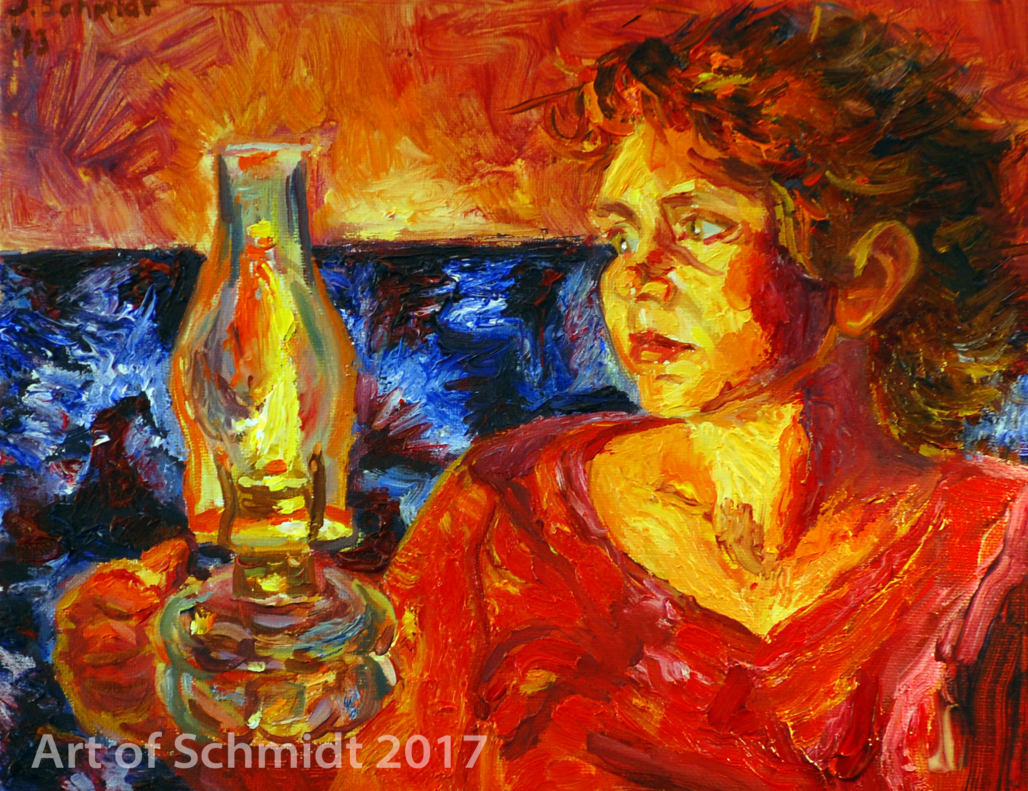
The painting of the week is inspired by my blog post, Why Artists Should Make Content-Based Art Work, and by the baroque artist, Georges La Tour, who specialized in portraits lit by candlelight. Self-Portrait with Oil Lamp, Oil on Canvas, 11 x 14 inches, 2013, $250.00. This item is available for purchase on my artist commerce site: https://www.etsy.com/shop/ArtofSchmidt.
I am posting a recently completed, acrylic painting, Rooster, Hen, and Chick. In a manner similar to my commissioned work, I started with a three step process. First, I decided on the composition and reduced the color photo referenced to three values in black, gray and white. After that, I began painting in the local colors, or the colors that I actually saw in the photo. Lastly, I did some problem solving with the composition by changing the arrangement of the chickens and by adding a baby chick to balance out the composition and fill in the empty space. The painting is available for sale on my Etsy site: https://www.etsy.com/shop/ArtofSchmidt?ref=seller-platform-mcnav. I will also be adding this painting to my Red Bubble site tonight so that it will be available in a variety of formats such as coffee mugs and fine art prints! Thanks for looking!
Stage 1: I began this painting by taking the reference photos into Photoshop and changing them from color to black and white. Then I started painting the acrylic painting in three tones: black, gray and white to simplify the image, and make sure that the values are well balanced.
Stage 2: I started adding in local color to match the colors I saw in the color reference photo.
Stage 3: I decided that the composition needed to be revised and I chalked in an alternative drawing with Rembrandt Soft white pastel. i also added the chick on the right hand side to bring in some lighter values and fill the empty space on the right.
Stage 4: I continued painting in the local color with Liquitex Acrylic paints until I was happy with the values and colors.
This week I am continuing my journey which started with a three value sketch and followed up with some colored sketches with watercolor and Caran Ache wax pastels. Yesterday I began painting the acrylic paintings based on the color sketches. It has been a rocky start and my inner critic has been relentless with negative chatter. Today I am trying to emotionally distance myself from the paintings and ask them what they need from me. Do they need more light, more color, to take something or add something to make them feel complete? This project is showing me how insidious my inner critique can be and how to practice self-compassion so that I don’t sabotage the artwork
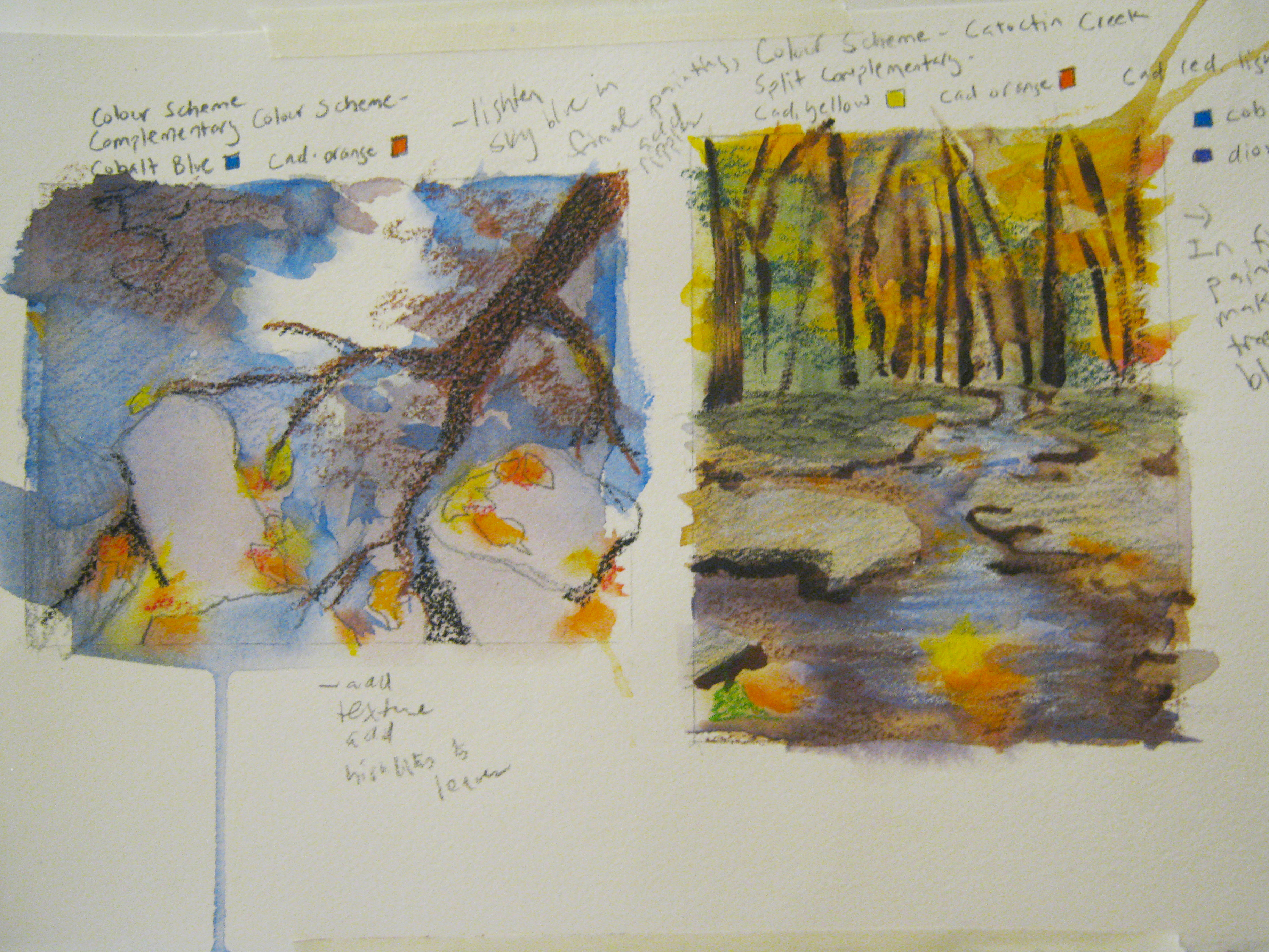
Two color sketches to use as guides for the final acrylic paintings.
. Here are my progress paintings. I will post additional photos later when I have made more changes to the work. These paintings will be on display this October at the Frederick Coffee Company in Frederick, MD as Artist of the month. The theme for the art show will be Autumn and all works will be for sale!
This is a painting of Catoctin State Park in Thurmont, MD.
Pictured is a painting of Catoctin creek which is inspired by Monet’s water lilly series.