What to do when a painting goes wrong?

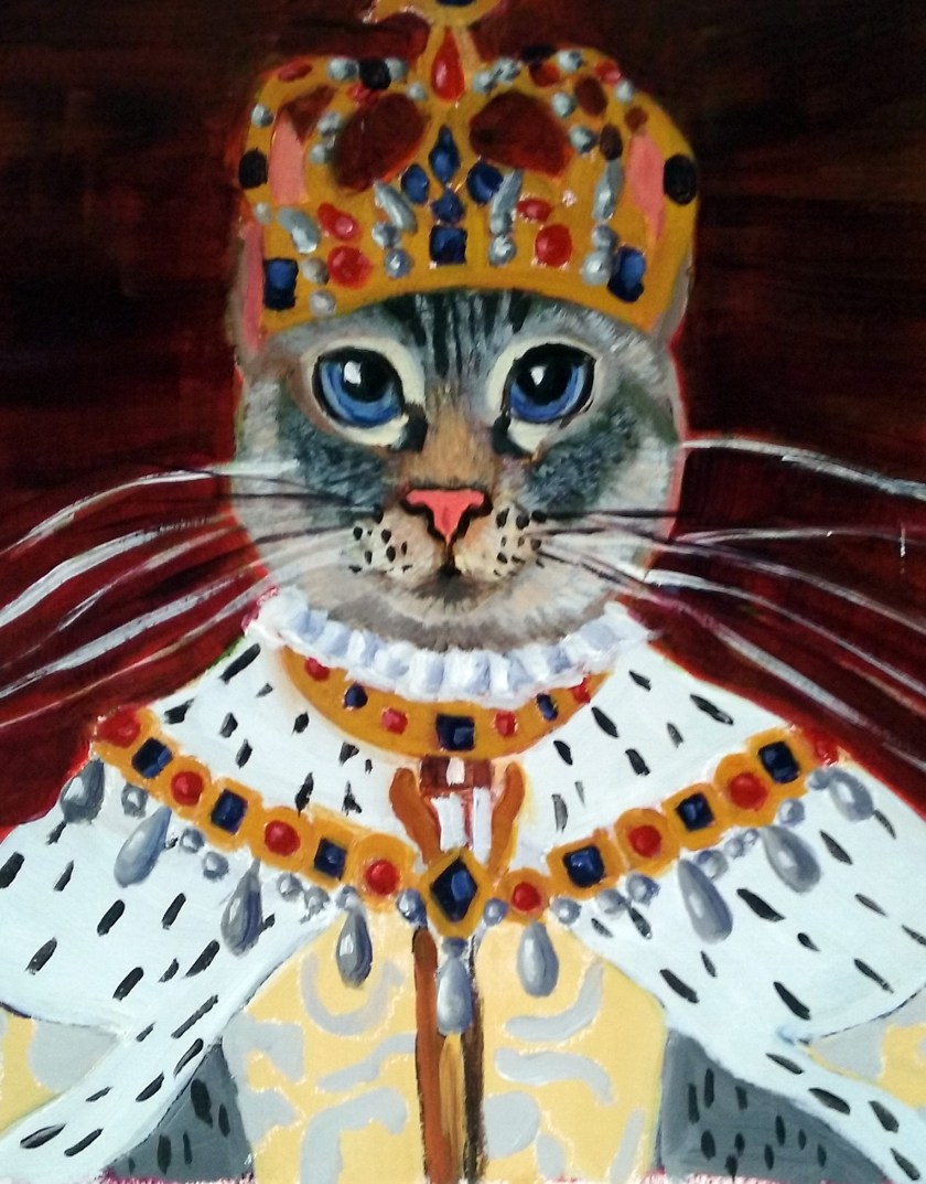
What to Do When a Painting Goes Wrong


Hello Friends, family, and fans,

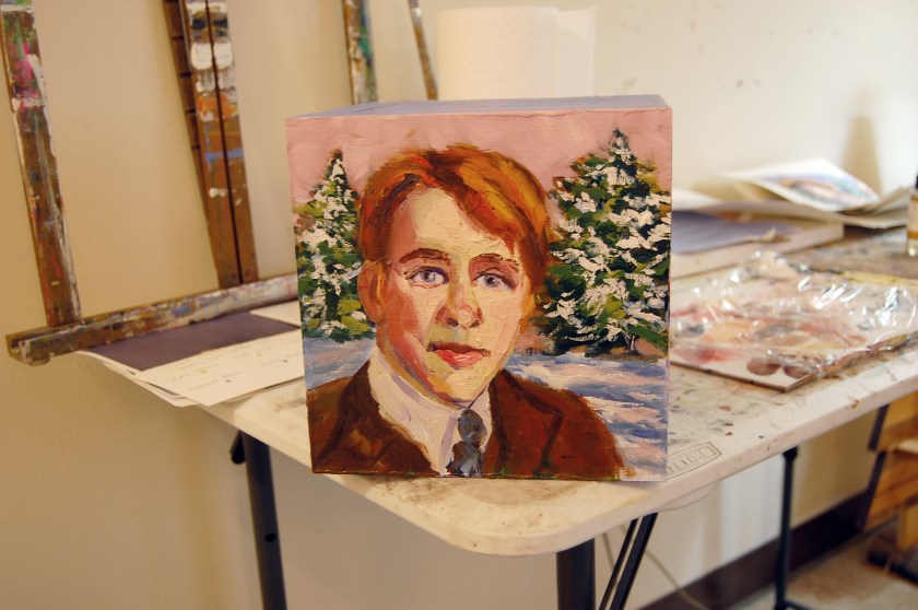
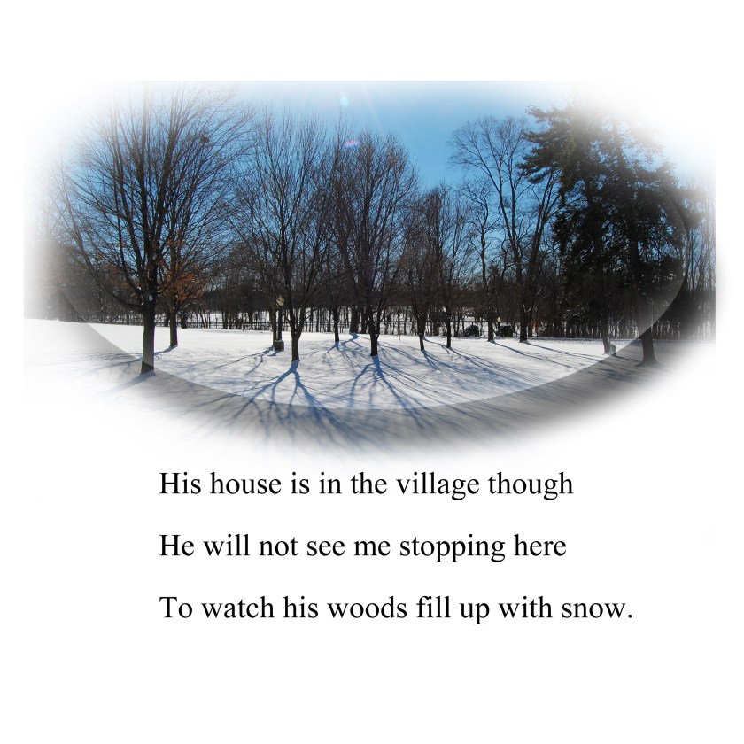
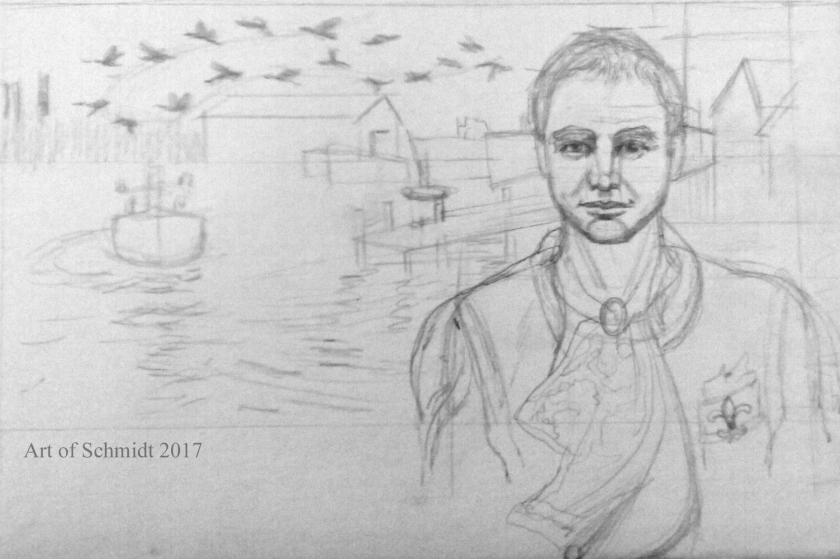
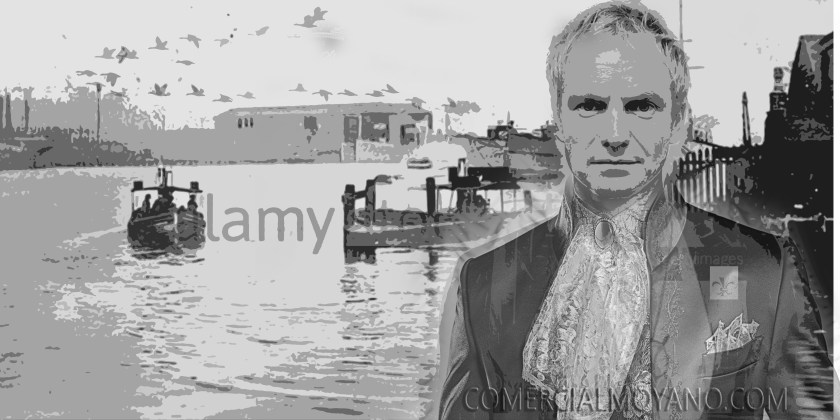
I am so glad you stopped by to read my post today!  While this blog post is a recycled one written several years ago, the artwork I am posting is completely new, and part of my new art portfolio. This week I am featuring the painting process of my latest work in progress, The Almighty Dollar. Its a mixed media collage which illustrates the poem, The World is Too Much with Us, written in 1807,The world is too much with us, flatStage 1, Almighty dollar, flatMasonite board. stage 2, flatcomposition stage 3, flat 
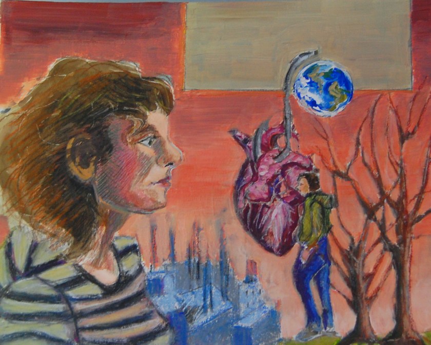
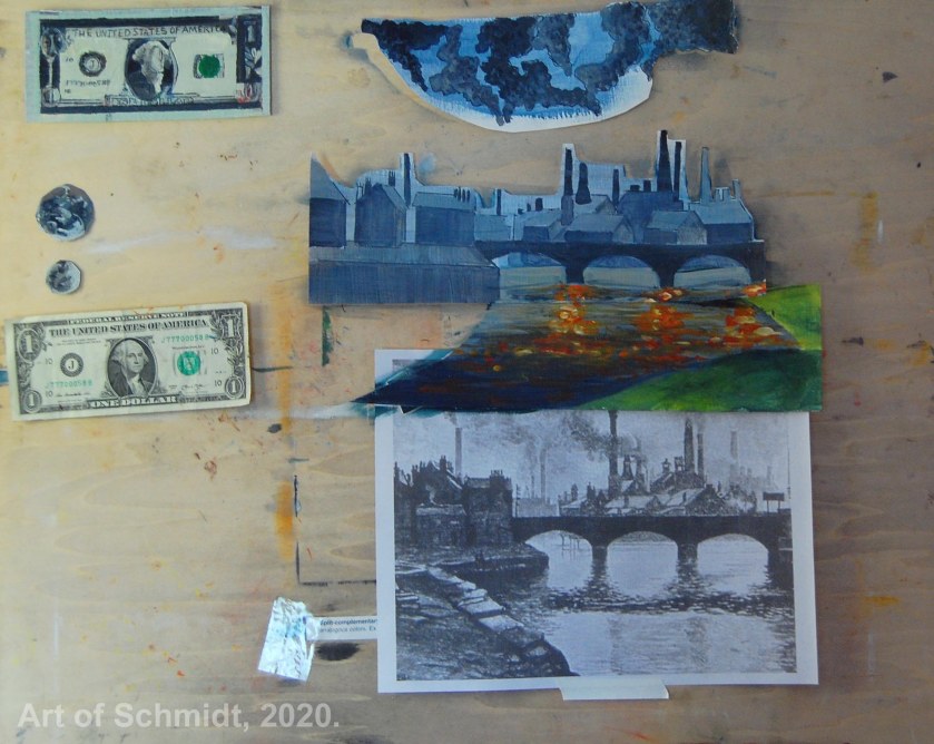
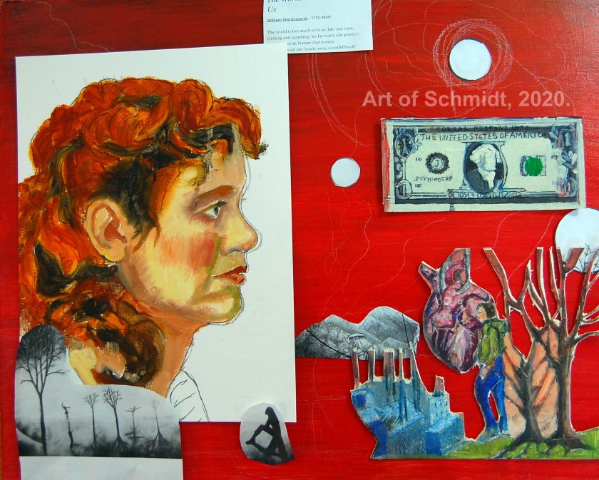
by William Wordsworth. Although this poem was written in the 19th century, the theme of capitalism and greed is still relevant today. I think that’s what makes great art and poetry, something is written or painted in the past, which still resonates today! If you are working on an artwork or other creative project and feel stuck, I hope this post will help give you encouragement to carry on, or just start over again.

If you are a creative type or if you like to make things, you have probably encountered the moment when the finished product you imagined, does not live up to your expectations. Creative types such as musicians, composers, producers, dancers, writers, artists, photographers, cooks, and makers of all types, can probably tell you what it feels like to hit a wall with a project, and how it felt, and what they did to navigate that feeling of utter frustration. As an artist, I have experienced this frustration more times than I can count. Some paintings and drawings are simply learning projects and are difficult to salvage, while others can be fixed. I know it’s been said that you learn more from your mistakes than your successes, but when I get to a point in a painting or drawing and I realize that the painting or drawing doesn’t look right, it can be really frustrating. I start doubting myself, feel like giving up, or doing something that I am not good at, like cooking or cleaning because I know that I am not good at these things, so my expectations of success in these domains are much lower than for painting or drawing since I have no training in cookery or housekeeping.  Since I know I am not a good cook, if it doesn’t turn out so well, it’s a waste of ingredients but I don’t feel as emotionally attached to the outcome as I would to a painting or drawing.

I recently read a forum question on the website, Wet Canvas.com, and the question of the day was,” When should I stop working on a painting? I was intrigued by the question, and wondered how other artists dealt with paintings that can “look like a dog’s breakfast.” I read about a variety of solutions suggested by artists who had hit the wall creatively. Some were familiar to me, like my tendency to put the painting away and stop looking at it for a few days, weeks, months, or even longer. Others were not as familiar such as putting the painting somewhere where you can see it, such as on an easel in a living room, and then taking time to look at it from time to time to diagnose the problem. Another favorite technique is to write a list of things I want to change in the painting, be it the drawing, colors, value, edges, etc.  In my case, some of the artwork I have abandoned was started about two years ago, and I am just now starting to look at the sketches and Photoshop files.

This week I took some time to work some more on my acrylic painting, Waiting: Creative Block. I realized that there were several things bothering me about it. The colors and values, and the composition were some of the biggest glaring errors.  I am realizing they there are many reasons why this painting series of poetry illustration works have been abandoned. One of which was being too busy with other things to give the series the proper amount of time it requires to get things right, such as the composition and the drawing. Since I dropped out of the Social Work program at Frederick Community College, I do have more time to work on paintings. And since I have deliberately looked at my schedule e and started marking studio days on the calendar, I have more “intentional “time.
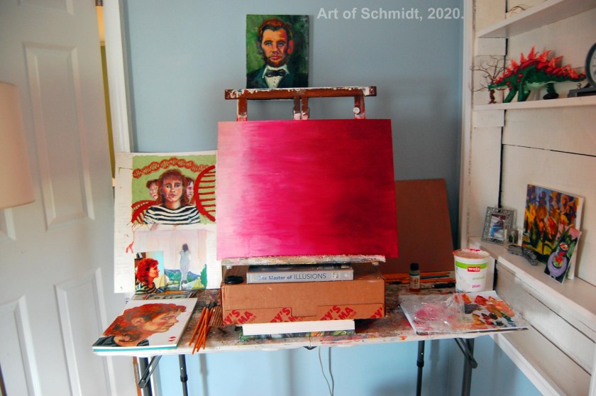
Mixed Media: A Portrait with collage and mixed media

mixed media collage
Portrait of my grandmother, Gladys, with soft pastels, watercolor pencil, and torn paper collage, stage 1.
mixed media portrait collage
Portrait of my grandmother, Gladys Carter, stage 2.
mixed media portrait collage
Portrait of my grandmother Gladys, stage 3.
Mixed media portrait collage
Portrait of my grandmother Gladys, stage 4.
book cover picture
The Painted Art Journal, by Jeanne Oliver.
painted journal collage demonstration, flat
The Painted Art Journal, torn paper collage demonstration. 

Art of Schmidt Newsletter

Hello Friends, Followers and Fans,

It has been a super busy season for me, managing the daily tasks of life, plus buying a new home, and various other things, so I haven’t posted as often as I would like. Meanwhile, I am researching articles that I think would inspire future blog posts that would be of interest both to artists and nonartists. While I am working on that, enjoy a peek behind the scenes into my latest pet portrait custom art order, which is inspired by a portrait of Elizabeth 1. Bandit, full portrait, color sketch 2800px-Elizabeth_I_in_coronation_robes (1)Art of Schmidt Newsletter, March 2018, page 1, final, final, flatArt of Schmidt, 2 March 2018, final, final_edited-3Art of Schmidt, 2 March 2018, page 3, final, final_edited-2Art of Schmidt, 2 March 2018, page 4, final, final, complete

I’m taking a break from blogging

Hi Friends, Family, and Followers,

I am taking a break from blogging on my Art of Schmidt site until life calms down a little. I’ve been juggling an art show deadline that’s looming and the art hasn’t been coming

Stopping by the Woods, one point
Stopping by the Woods, Mixed Media, 2018, Jodie Schmidt.

together, and some health issues. I hope to get back to blogging more frequently after the art show opening, On and Off the Wall at the Artists Gallery in Frederick, MD. I will be joined by many local artists who work in a variety of media. All art will be for sale via silent auction and proceeds will help raise funds for the continuation of the gallery, which is operated exclusively by artists. For now, here are some progress photos of my box entry, Stopping by the Woods. Here is a link to the art show if you want to know more about it:Box Side 2_edited-1Box Side 3_edited-1, finalBox Side 4_edited-1 http://www.theartistsgalleryfrederick.com/march-2018-box-show.

In my next post, I hope to show you the completed project, but for now, I am still figuring out how to bring it to a successful conclusion. I was not happy with how the sides of the box turned out, so I  am re-doing them from scratch in Photoshop. Next week, I hope to transfer these images to the box and paint the panels in Acrylic. Here are the Photoshop files in progress that will be displayed on the other sides of the box. The box is based on the poem, Stopping by the Woods on a Snowy Evening, by Robert Frost. I love this poem because it is so mysterious. Is he talking about death, life, or the push and pull between responsibilities and dreaming, when he stops to admire the snowy woods, but then decides that he has other things to get back to at the end of the poem when he says he has “miles to go before I sleep”. I think the poem can be open to many interpretations and that’s what makes it interesting. Thanks for stopping by!

The Importance of Color in Art: Choosing a Color Scheme

Today I am blogging about an introduction to the color wheel and how artists can use it to choose an effective color combination. Since last week, I have been consulting a reference book entitled, Color is Everything, by Dan Bartges. I wanted to try out some various color schemes for my Biographical Portrait of Sting, which I posted about in last week’s Sketchbook blog post.  After consulting the book about possible color schemes, I tried out two versions of a tetrad color scheme; one is described on pg. 35, and consists of oranges, reds, and greens, while the other color combination includes blue-green, red-orange, yellow-orange, and blue-violet and is described on page 36 of Bartge’s book.

Sting, pencil sketch
Line sketch based on the Photoshop collage.
Sting in Landscape, with symbols, with black and white
Photoshop collage I made with various photographs.
Sting's Biographical Portrait #1, flat
Here is version one of my color sketch, using a tetrad color scheme of blue, orange, red and green. This sketch was made with watercolor and pencil.
Sting's Biographical portrait version #2, flat
This is version two of the color sketch tetrad version # 2, with blue-green, red-orange, and yellow-orange. The sketch was made with watercolor and pencil

But before I get into the definition of tetrad color schemes, I would like to give a short overview of the color wheel and how it can improve an artist’s artwork.According to the article, “Color Psychology: The Emotional Effects of Colors”, retrieved from http://www.arttherapy blog.com, the color wheel displays the three primary colors and its secondaries, and the twelve colors which are included on the color wheel are: yellow, yellow-orange, orange, red-orange, red, red- violet, violet, blue-violet, blue, blue-green, green, and yellow-green. The most important colors displayed on the color wheel are red, yellow and blue, from which you can mix almost any color. (ibid) However, this concept should be considered in a theoretical context, because paints do not necessarily contain only one color. (ibid) In fact, paints often contain residues of other colors which can affect the final outcome of color mixtures (ibid).  Some colors that you can mix from the two primaries include yellow + red= orange and red + blue= violet.  These colors are called secondaries.(ibid)  It’s interesting to read that primary colors theoretically mixed together, can create any color you wish, but that in practice, it is not always so easy. I think that this is a concept I have grasped as a seasoned painter but did not have words to explain it. This is why I need to buy specific cool reds such as alizarin crimson, or warm reds, such as carmine to get reddish colors that are either warm or cool in tone. Now I have evidence to support my observation and I can explain to others why I need to buy so many different paint colors to create specific colors!

According to the author, Bartges, (2008), a triadic color scheme utilizes three colors which are equidistant from each other on the color wheel, and these colors create “a strong, triangular relationship.” For example, Bartges, 2008, states that a frequently utilized triadic scheme for landscapes includes green, orange and violet. Furthermore, in the words of  Bartges, 2008,  the “most visually powerful triad is red, yellow and blue, which are called the primary colors”.

I decided to apply this knowledge about triadic colors to my portrait of Sting. While I knew I wanted the colors to be pleasing to the eye, I didn’t want them to take center stage. Instead, I wanted them to complement the symbolic nature of the artwork. In this drawing, I wanted to tell a story about Sting’s ancestry and family stories, which I learned about by watching a PBS tv show entitled, Finding Your Roots, a few weeks ago. In this drawing, Biographical Portrait of Sting, I wanted to tell a story about Sting’s ancestry and family stories with references to his great-grandparent’s trade as lace makers, their migration to France, and to describe the setting of his hometown in Newcastle, England. These items were symbolized by the Canada geese migrating in the background, the lace handkerchief, the fleur de lis symbol, (which is often associated with French royalty, according to Britannica.com), and the ships and dock of the Tyneside docks represent the setting where Sting grew up amongst the shipbuilding trade in the 1950s. If you are interested, you can learn more about Sting’s family story by visiting the following website: http://www.pbs.org/wnet/gperf/blog/stings-roots-beyond-england/. The PBS website includes an overview of the television series, Roots, Finding your roots,   which features an episode that investigates the family history of Sting, Sally Field, and Deepak Chopra. Thanks for stopping by! I hope to continue work on the color sketches pictured here and post the results on next week’s blog post.


How to Develop Your Artistic Muscles: Make a Sketchbook

A few weeks ago, one of my art fans complimented me on a painting which she had viewed on my Art of Schmidt website, entitled, Phyllis and Dad. She said that she liked the colors, that she admired my talent, and wanted to know the story behind the painting. I told her that the painting was based on a collection of family photos which I had collected and that I always remembered my father as being older than other kid’s fathers. I also shared that this was the first photo I had ever seen of my father taken when he was young. Although I do not know his exact age, as the picture is not dated, I would estimate that he was in his early twenties when this photo was taken of him and his first wife, Phyllis.

I was of course, grateful to hear the compliments about my artwork, but at the same time, I wanted to share that the artwork I post on my website does not come about by magic. It takes a lot of effort.  Furthermore, sometimes more than one version of a painting or drawing is created to lead to the finished product that people see on my website, commerce site, and social media feeds on Facebook and Instagram. In fact, I have to practice on a weekly basis to keep my drawing and painting skills from getting rusty. During this conversation, I shared all of these insights with her and I hastened to add that if I relied solely on my artistic “talent” then it wouldn’t get me very far. Instead, I have found that practicing art is much like practicing a sport or playing an instrument. I believe that in order to get good at any of these disciplines, one needs to practice, a lot, and on a regular basis to maintain a certain level of skill. And sometimes it may require me to make a drawing or painting over and over again until I get it “just right.” In the words of songwriter, Sting: “I will reapply the needle of the record player again and again to the bars of music that seem beyond my analysis, like a safecracker picking a lock, until the prize is mine.” (Sting, Broken Music, dust jacket cover, 2003).

I was thinking about this conversation this week when I was trying to decide what to blog about. While I was pondering this, I wondered how to make this knowledge which I have gained about the need for artists to practice their art, into an applicable blog post that anyone can learn from. According to the author, and textile artist, Bren Boardman, one specific way for artists to stay “in practice” with their craft is to keep a sketchbook. The sketchbook serves as a repository to record their ideas and inspirations, such as “color swatches, quotes, magazine clippings, newspaper cuttings, or reference photos” for artwork in progress. (Boardman, Bren. “Sketchbooks and Mind Mapping for Artists”, https: www.textileartist.org).  Bren Boardman, textile artist, and author of the article, “Sketchbooks and Mind Mapping for Artists”, states that sketchbooks can help artists to develop their ideas for artwork and that using a mind map in their sketchbooks is an effective strategy for fleshing out ideas for new artwork. In her article, she provides some useful tips on how to start a mind map diagram, sort of like the “web” I remember from grade school in which my teachers used to help my fellow students brainstorm new ideas. In Boardman’s mind maps, she starts with a word or phrase that encapsulates her concept for a new artwork and draws connecting branches, which describe her ideas in more detail, sometimes using imagery. To start a mind map, she recommends that you write a word or phrase, with which you can associate, the main idea. (Boardman, Bren. 2013)

In addition, Boardman states that it is helpful to consider what type of sketchbook you would like to create such as a reference sketchbook, where you might “collect color mixing tests, color swatches or samples, or an idea generation sketchbook”; such as creating a mind map which describes the process and ends with the final result. On the other hand, perhaps you might make a sketchbook that would describe a trip or journey. Furthermore, if you still feel overwhelmed by the process of starting a sketchbook, I’m including a list of suggestions that Boardman offers in her article to get you started with the process. For example, you might include: “photos, magazines or prints, magazine or newspaper cuttings, drawings, sketches and doodles, text, poetry, stories, thoughts, thoughts, letters, extracts, statements, words, fabric, threads, wools, beads, buckles, papers of all kinds.” (Boardman, Bren. “Sketchbooks and Mind Mapping for Artists”)

In this blog post, I include my process for adapting  Boardman’s mind map idea and translating it into a project I wanted to create of a genealogical portrait of recording artist, Sting. My inspiration for this project was based on an overworked watercolor painting I made last summer, a portrait by Durer of a man standing in front of a landscape,  and a TV miniseries, entitled, Finding Your Roots, with Henry Louis Gates, J., on PBS. The segment I took inspiration from was called, “Sting, Sally Field, and Deepak Chopra,” and was filmed in 2014. Gates spoke with each individual in turn and he shared what he had learned about their ancestry through genealogical research. In particular, Gates shared that Sting’s third-great grandparents were lace makers who started a family in Nottingham, England in the 1820s. However, due to the Industrial Revolution, which led to mass production of products and consumer goods, they were forced to seek work elsewhere in Calais, France and in Australia.

I took inspiration from this TV series, a failed watercolor portrait of Sting, and from a sketch by Duerer which featured a portrait of a man and a landscape in the background.  To record my thoughts, I took notes as I watched the TV segment and I re-draw these thoughts in a mind map. I knew I wanted to make a portrait that was different from the typical face front painting or sketch of a person with a wall as background, and that I wanted to let the artwork tell a story about the person. I wanted to use symbols to tell the person’s story so that it would lead the viewer to contemplate the scene and ask questions about what the symbols might mean. After I completed the notes, I set to work looking for images on the internet of Sting, his hometown of Wallsend, England, and some symbols to describe his ancestor’s migration to France and their profession as lace makers. Then I put all the photos together in Adobe Photoshop to create a collage as a reference for the resulting sketch and three value watercolor painting.

Sting watercolor portrait, flat
Original watercolor painting of Sting with English landscape.
Sting mind map final
Mindmap I made based on the TV mini-series, Finding Your Roots, with Sting, Sally Field, and Deepak Chopra.
Tennis-mindmap
Example of mind map from Wikipedia.
portrait-of-caspar-tower-and-a-river-landscape-1520
Portrait of Caspar, Tower and a River Landscape, Albrecht Durer, 1520. This portrait by Durer, influenced the composition for Sting’s biographical portrait.
Sting in Landscape, with symbols, with black and white
Photoshop collage I made with various photographs. I created a black and white image and applied a cut out filter to create a value scale in black and white. 
Sting, pencil sketch
Line sketch based on the Photoshop collage, drawn with pencil on backing board.

Stay tuned for more updates on my painting process of this portrait! Thanks for stopping by!

Art Show: Light and Color

Hello Friends, Family, and Followers,

I just got back from displaying my oil and acrylic paintings at the Frederick Coffee Company in Frederick, MD. My art will be on display from October1-October 31st as an artist of the month. On display are landscapes, still life, and portraits. All items are for sale and are framed. For more information about the cafe hours or address, visit http://www.fredcoffeeco.com.

Painting of the Week: Dad and Phyllis

Here is my completed oil painting of the week. This work features a portrait of my dad and his first wife, Phyllis when they were newly married in the early 1950s. It is based on an old black and white photograph that I found when I was cleaning out my dad’s house while he was in the Assisted Living facility back in 2011. I used the photo as a jumping off point for the composition and drawing but used my imagination when choosing the color palette, to create a color harmony of complementary colors of orange and blue, and yellow and violet. My painting is based on a series of oil paintings that I completed about my father’s life, based on family photos from different times in his life from childhood to young adult, to older adult to help process my grief during his series of strokes and hospitalization. I found that painting could provide a safe refuge for me when most days were uncertain and chaotic as I waited to get text messages, emails or phone updates on my dad’s health from family members, and tried to “keep it together” so I could get on with my daily life activities, like cooking, cleaning, going to work, and just getting out of bed every morning. The painting, Dad and Phyllis, are available for sale on my Etsy page: https://www.etsy.com/shop/ArtofSchmidt?ref=seller-platform-mcnav. Dad and Phyllis

Title: Dad and Phyllis

Medium: Oil on Canvas Panel

Size: 9 x 12 inches

Item has been custom framed so it’s ready to hang on your wall!

Abraham Lincoln Portrait: Available for Sale on Etsy

Hello Friends,

As promised, I am posting a new painting every week that will be available for purchase on my Etsy shop,  https://www.etsy.com/shop/ArtofSchmidt?ref=seller-platform-mcnav. Here is a portrait that I started a few years ago, back in 2012 to be exact. However, a few weeks ago I looked at the painting and I felt it could use some touches of thicker paint to add interest to the painting, which had been painted fairly thinly at the time.  I also toned the background down to a blue-gray color so it wouldn’t compete with the portrait of Abe Lincoln.This is the finished result, from left to right. Thanks for looking!

Abraham Lincoln Paintings (for sale)

Hello Friends,

I have added two new portraits I made of Abraham Lincoln, my favorite United States President to my Etsy Shop at https://www.etsy.com/your/shops/ArtofSchmidt. These two paintings are pictured below. I was inspired to create these pieces by a day trip to Gettysburg, PA several years ago, when I happened upon a gallery owned by Gettysburg, Pennsylvania artist, Wendy Allen. Wendy Allen has dedicated many years of her life to capturing the likeness of Abraham Lincoln in a variety of fun and colorful incarnations from Andy Warhol pop art inspired to the tonal art of Pablo Picasso. Also, because Lincoln is one of my favorite Presidents, I knew I wanted to capture him on canvas.

He is an inspirational figure to me for so many reasons and he never let any obstacles stand in his way. Although he had a limited formal education and very little encouragement from his father to discover his potential and unique talents, he went on to achieve the American dream we all aspire to achieve. His step mother, Sarah Bush,  provided emotional support, and books, such as the Bible, Aesop’s Fables, The Pilgrim’s Progress, and Lessons in Elocution, to help Abe with his self-guided education. It just goes to show what can happen when someone believes in you, and you believe them!

In the meantime, I am also working on some acrylic paintings of Civil War Soldiers in watercolor and acrylic. I will be posting progress photos of these paintings this week. Stay tuned!