The Girl with the Pearl Earring and the Phoenix Legend

A phoenix is a mythical bird that is a fire spirit with a colorful plumage and a tail of gold and scarlet (or purple, blue, and green according to some legends). It has a 500 to 1000 year life-cycle, near the end of which it builds itself a nest of twigs that then ignites; both nest and bird burn fiercely and are reduced to ashes, from which a new, young phoenix or phoenix egg arises, reborn anew to live again.

Source: Wikipedia


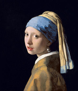
I’m stealing this tidbit about the Native American legend of the Phoenix, from blogger, Julie Fan-Fei Balzer of Baltzer Designs because it seems so apropos to the struggle I am facing about how to start again on a failed painting that I started last week, Girl with a Pearl Earring, by Vermeer, painted in 1665. Source: Fan-Fei Balzer, J. (January 3, 2011). Like a Phoenix. Retrieved from http://balzerdesigns.typepad.com/balzer_designs/2011/01/like-a-phoenix.html.

In some ways, beginning a project over again after you are dissatisfied with it is like a death and re-birth. You have to let go of what isn’t working in your artwork (death) and be open to letting in what will work in a new piece of artwork, (birth). This process might include a new approach to the painting or a more positive mindset. I also feel that this symbol of the phoenix that lives, dies, and is reborn is a powerful affirmation, and I feel in need of that kind of empowerment this week to make the plunge and actually get to work on starting this new painting…

It seems that this week I have hit the wall on several creative fronts, whether it’s in writing this blog or maintaining a daily painting practice and finishing the projects I start. I have a collection of unfinished paintings and drawings that has been accumulating in my art studio. The process starts out something like this, I will see a reproduction of a painting in an art book and feel excited about the prospect of re-creating it myself, begin the work, and then get stuck because something isn’t working and I can’t figure out how to fix it. Then, out of frustration, I start up another painting just to try and move forward and not let too many days go by without painting or drawing.

All of this stagnation has brought me to a standstill and made me ponder some deep questions, such as: “What am I hoping to accomplish with this master copy series?”, “Why do I paint?, and “Who am I as an artist?”. Recent disappointments in my creative life and in my personal life have also contributed to my doubt and stagnation as an artist. I’ve had to work hard to dig myself out of this mire I have found myself in… And I have been opening myself up to other artistic sources in blogs and documentaries, such as artist/blogger, Julie Fan Fei Blazer’s blog, and a recent documentary by musician John Mayer, called Someday I’ll Fly on YouTube, to fill the creative well inside me.  Both have shared their journeys in the creative process, talking about their trials and successes, and most importantly about their craft. In his documentary, Someday I’ll Fly, Mayer talks about creativity as a battle to be fought, which all artists are fighting, and it definitely feels like a battle this week!

I’ve also started a new weekly drawing practice, working in a sketchbook with pre-planned subjects for each day so I won’t have to think about what to draw/paint, while I am trying to get up the courage to start this painting again. I’m hoping this forward motion will propel me to jump off the diving board and start this painting after a week of procrastination.

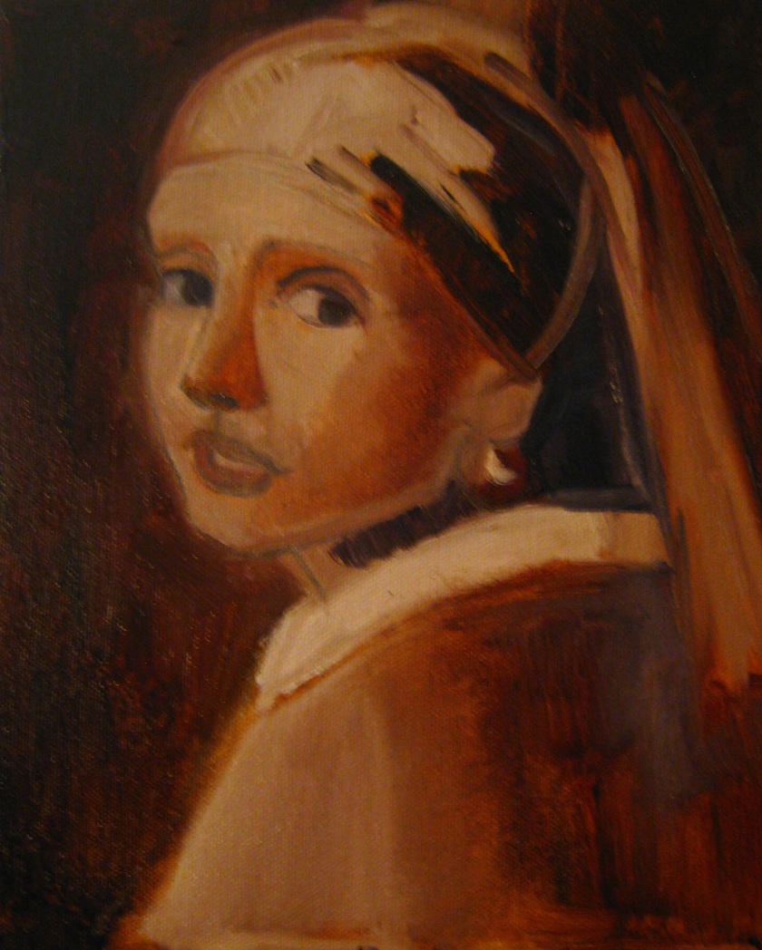
So here is my revised version of Girl with a Pearl Earring, ca. 1665, by Vermeer, painted with Gamblin 1980 oil paints on prepared canvas. I started with a brand new canvas for this painting and focused more on checking the proportions to the original painting as often as I could. This stage is called the under painting and it concentrates on the three main values in a painting of lightest, middle, and darkest. I used a burnt sienna oil paint and mixed it with titanium white for lighter areas while adding a mixture of ultramarine blue, viridian green and alizarin crimson to create my own black. To thin out the paints, I used a non-toxic, Solvent Free  Safflower Oil Gel made by Gamblin.  When this layer dries, I will be working on blocking in the local colors of flesh tones, the blue and yellow turban and the yellow ochre coat with fur collar. I will also be delving into some of the questions I asked in this blog about why I paint and what I hope to accomplish with this master copies series.

Girl with a Pearl Earring, After Vermeer, re-do
Girl with a Pearl Earring, After Vermeer, Jodie Schmidt, 2017

.

Meisje_met_de_parel
Girl with a Pearl Earring, Johannes Vermeer, 1665.


Master Copy, Girl with a Pearl Earring, Tutorial: How to Mix colors

Last week I demonstrated how to start a master copy of the painting, Girl with a Pearl Earring, by Vermeer, ca. 1656. I demonstrated the initial stages of selecting a color copy reference of the painting, explained how to draw a grid, described a method of tracing by using a window and finished up with a demonstration on how to paint a three value painting including white, gray, and black paint. Today I will explain the process of transforming a three value painting to an initial color lay in painting.

Step One: Use Three Value Painting as a Guide to Identify Lights and Darks

Now that the painting has three values, white, gray and black I can use that as a guide to finding the lights and darks in the painting. I began the initial color lay in by trying to break down the main colors I see in the color reproduction of, Girl with a Pearl Earring. The seven main colors I noted in this painting were: Blue, Yellow, Yellow Ochre, White, Black, and a light flesh tone. I got the idea to do an initial color lay in from the book I mentioned last week, The Complete Oil Painter, by Brian Gorst. I laid out these basic colors from Liquitex Acrylic Paint brand on my palette: yellow ochre, titanium white, ultramarine blue, napthithol crimson, burnt sienna, ivory black, primary yellow. I added tomato red to my palette as a substitute for alizarin crimson. Using a palette knife, I began mixing up the colors I wanted using large amounts of paint to make nice large piles of paint, which I call a color string.  I began the painting by starting with the darkest value which was a bluish black in the background of the painting. To create this dark value, I mixed ultramarine blue and ivory black.

After I had established the darkest value and painted in the background area or negative space, I started painting in the middle values such as the blue turban, the gold robe, the light yellow scarf, and the fairly light skin tone. For each color, I mixed up two values one was darker and the other was lighter. To make lighter values, I added small amounts of white to the pre-mixed initial local color. And to darken a color, I added ultramarine blue or burnt sienna. I reserved using black for the darkest colors. Periodically, I sprayed the canvas and the palette with water to keep the paints wet, so they wouldn’t dry out. I saved the lightest lights for last, such as the whites of the eye, the fur collar and the highlights in the eyes and mouth. To keep the edges between each value soft, I painted quickly, using two large brushes with light and dark values painted right next to each other and allowed them to “melt” into each other. This technique is called painting wet into wet, and keeps the painting from having harsh outlines. After I had painted out all the white areas, I began painting in the shadowed areas of the painting, including the face, the turban, the scarf, and the robe. Important: Remember to wash out your brushes in a water jar every time you switch colors and use a paper towel to dry off the paint brush so it won’t get too watery. Also, make sure that the paint doesn’t dry on your brushes and be sure to clean each brush thouroughly in water after you complete a painting session.

Step Two: Take a Break from Painting

This next step of taking a break, may seem counterintuitive, but I find it helps me to be more objective about a painting’s progress. After I completed the initial painting session, I took a break for several days to get a fresh take on it. When I returned to the painting, I wrote down a list of things I would like to change and I checked the facial proportions to be sure that the drawing was correct. In the next session, I corrected things like proportions, added shadows with a glazing technique,  and tried to make more accurate color matches. To help obtain more accurate color mixtures, I researched Vermeer’s palette and painting techniques. And to create the glazed shadow areas in this painting, I used a Slow Dri blending medium by Liquitex in my darker paint mixtures to thin out the consistency of the paint.


Master Copy Tutorial: Girl with a Pearl Earring

Last week I talked about the importance of copying the work of the old masters and this week I am going to give you a step by step tutorial about how to get started. I have several master copies in the works, but I am choosing to focus on Vermeer’s well-known work, Girl with a Pearl Earring, circa 1656, according to Maritshuis, 2014. If you wish to read more about this painting, you may visit the following link: Details: Johannes Vermeer, Girl with a Pearl Earring, c. 1665, Mauritshuis. Retrieved on 9 December 2014. This citation is from an article about Vermeer’s painting, Girl with a Pearl Earring, which I found on Wikipedia. The original painting was painted in oils on canvas, but to save drying time, I used acrylic paints.

Step One: Make a Grid from a Photocopy of a Master Copy

My first step in creating a master copy of Vermeer’s, Girl with a Pearl Earring, was to locate a good print copy which I could use to create a grid for the initial sketch. Creating a grid helped me to make sure the proportions of the head were proportionate to the copied image. I photocopied an image of Vermeer’s painting, Girl with a Pearl Earring, from the book, Vermeer, by Arthur K. Wheelock, Jr. After I made the copy, I created a grid, measuring one inch from the horizontal and vertical edges of the printed copy with a ruler. After I measured out the markers for the grid, I drew vertical lines to create the vertical axis. Then I drew horizontal lines for the horizontal axis.  Each box on the horizontal lines of the grid should be numbered starting with 1, and the vertical boxes should be labeled A, B, C, etc. After that, I created an exact duplicate of this grid on a clean sheet of sketch paper. Note: it is very important to ensure that you have the exact amount of boxes on both the vertical and horizontal axes on your grid copy as the one from the original, or the proportions may be incorrect. Also, be sure that when you draw vertical and parallel lines that your ruler is perpendicular to the picture plane and doesn’t shift, or it make affect the measurements of the one-inch boxes.

Step Two: Create a Duplicate Grid and Transfer it to Canvas with Carbon Paper

Next, I located my first set of coordinates on the vertical and horizontal axes, on my grid copy to start drawing in the edge shape of the portrait, i.e. A1. The artist, Thaneeya McArdle, gives an excellent description of this process with detailed visuals of the grid method at https://www.art-is-fun.com/grid-method/?rq=draw%20a%20grid. To complete the portrait, I moved on the next grid coordinate, and so on. My next step was to trace the completed grid sketch onto a clean sheet of sketch paper, using my window as a light box. I taped the original sketch to the window with masking tape, then taped a clean sheet of paper on top of the original. Then I traced the image to the cover sheet. The traced image was then transferred with a pen to canvas paper, using carbon paper, with the dark side taped face down.

Step Three: Paint a three value underpainting in Acrylics

Are you still with me? I know it sounds like a lot of steps…Don’t worry I am including some photos of this process to help jog your memory. So now we move on to the fun part, the painting itself. To break down the light and dark values, I consulted a well-used book from my art library, The Complete Oil Painter, by Brian Gorst, which gives a detailed demonstration about how to paint a monotone underpainting. I mixed up three values from darkest to lightest with Liquitex Acrylic paints and a palette knife using Burnt Umber, Titanium White, and Ivory Black. The darkest value was applied to the background, while the middle and lighter values were painted on the figure. Intermittently I sprayed the palette and the canvas with water from a spray bottle to keep the paints wet so they wouldn’t dry up, especially while I was mixing them. I also stepped back every so often to view the painting from a distance and be sure that the drawing in my painting was accurate, and made corrections as needed. These values will give me a roadmap of where to put light and dark values when I get into the color portion of the painting. They help to simplify the lights and darks without the difficulty of color matching. Next week, I will paint a “limited color lay in” with the local color

Meisje_met_de_parel
Photo copy, Girl with a Pearl Earring by Vermeer ca. 1656
Vermeer copy with grid
Photo copy, Girl with a Pearl Earring by Vermeer ca. 1656, with grid 
Vermeer paper copy with grid
Copy of Grid with pencil on sketch paper 


Vermeer Copy Light Box
Traced image of grid using window as light box


carbon paper trace 1
Carbon Paper used to trace image to canvas


Carbon Paper tracing, complete
Carbon paper tracing completed


Jodie Schmidt after Vermeer three value
Three Value Underpainting in Acrylic