This week I have really been struggling to come up with a new topic for this blog. At first, I thought I might write about time management strategies and how I have been implementing my Ideal Week schedule template I mentioned last week. However, the trouble with that topic is that I still haven’t taken the time to write it out, but I did download a copy of the Ideal Week schedule template pdf from Michael Hyatt’s website, and so it did get me started thinking about what I have been spending my time doing other than painting, and the reasons why I have been putting it off… Then I thought I might write about the top ten contemporary living artists in an article by Artsy.net, but as I read about what these artists represented in their work, it didn’t seem to fit the type of painting I do, so I decided not to do that.
After some reflection, I am realizing that one of the reasons I have been putting off painting has been that I have not had any inspiration about what to paint, despite the vague idea that I might start up my poetry series again. But somehow I haven’t been making much progress there. Instead, I’ve been working on other things for my art business that needed to get done, and which I have been procrastinating on, due to a large number of art shows. One of these tasks was to get up to date with my profit and loss sheet. Yesterday, I researched different blog topics that I thought might get me motivated to paint again, and I read my blog topics list. Amongst the topics I have listed, was one that stood out for me. That topic was to write about artists that you admire and why you like that particular artist. Immediately the name Richard Diebenkorn came to mind.
Perhaps I thought of him because it reminded me of a conversation I had with an old friend about artists, and she mentioned that her stepmother had introduced her to the art of Richard Diebenkorn. On the other hand, maybe I was reminded of a documentary about Richard Diebenkorn I had watched on YouTube several months ago which featured a presentation by his daughter in which she described his works and shared some interesting facts about his life, such as how his home in California influenced his art. Or perhaps I thought of Diebenkorn’s work because it reminds me of the kind of subject matter I used to draw and paint when I was an art student at McDaniel College, which was figures in interior spaces, with an emphasis on color. For whatever the reason, he came to my mind and so I started researching facts about his life and trying to learn all I could about his artwork.
From the article, Diebenkorn’s First Steps, on artsy.net, I learned that he was introduced to art at an early age by his father, Richard Diebenkorn, Sr. who entertained him “with pieces of cardboard placed between the folds of crisply pressed shirts from the dry cleaner.” (“ Diebenkorn’s First Steps”). As a young child, Diebenkorn drew trains and locomotives on the “smooth, white surface of the paper.” (Ibid). And, he continued to pursue art for many years after that, despite a lack of support from his father, who wanted him to pursue a more practical career path in law or medicine, during his time as a student at Stanford University, where he attended undergraduate classes in 1940. (“Richard Diebenkorn: Biography, Art, and Analysis of Works”). Instead, he decided to study art and art history, and he successfully combined influences from many art styles such as Abstract Expressionism, Color Field Painting and “belle peinture” or the beautiful painting.” (Ibid).
He was able to seamlessly shift from abstraction to figuration in his long career as an artist, painting figures in interior spaces, and abstracted landscapes and cityscapes of his home in California. (Ibid) But whatever the subject, he continued to incorporate bright color and shape, which gives his paintings an unmistakable brand as a Diebenkorn, not to be confused with any other artist. According to Amy Crawford, Diebenkorn was highly influenced by the artwork of Henri Matisse, another fine colorist. (The Lasting Influence Matisse Had on Richard Diebenkorn’s Artwork, Amy Crawford, March 2017, Smithsonian Magazine, www.smithsonianmag.com/arts-culture/lasting-influence-matisse-richard-diebenkorn-artwork. In addition to reading up on Richard Diebenkorn and his art, I gave myself the assignment to copy two of his paintings which describe his various subject matter of figures in interior spaces and abstracted landscapes. I had a lot of fun with drawing the shapes and mixing the colors. The two paintings I copied this week are Woman on a Porch, Richard Diebenkorn, 1958, oil on canvas and Cityscape 1, (Landscape No. 1), 1963, Richard Diebenkorn, oil on canvas. The one difference in approach to my paintings and Diebenkorn’s are that my version was painted in acrylic paintings rather than oils. I also include some of my original self-portraits in oils, because I think they show the connection in subject matter and color between my works and Diebenkorn’s paintings, although my approach is more restrained and traditional with subtle gradations of tone and color. Copying these paintings by Diebenkorn showed me just how much I enjoy painting the figure and using bold color. Since completing the 100 Faces in 100 Days drawing Challenge on Instagram, I have really missed working in color. Thanks for stopping by!

This is stage one of the painting I copied, Woman on a Porch, 1958, Richard Diebenkorn. Acrylic on Canvas. The original painting was made with oils.

Here is stage 2 in which I re-worked some of the colors to try and get closer to the original painting by Diebenkorn. Note: This painting is a copy, not an original work and is intended for educational purposes only.

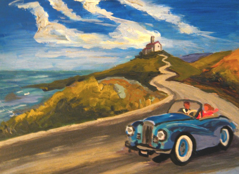
Here is another copy of Diebenkorn’s painting, Citycape 1, (Landscape No.1), 1963. I just started this painting today. Also a copy.

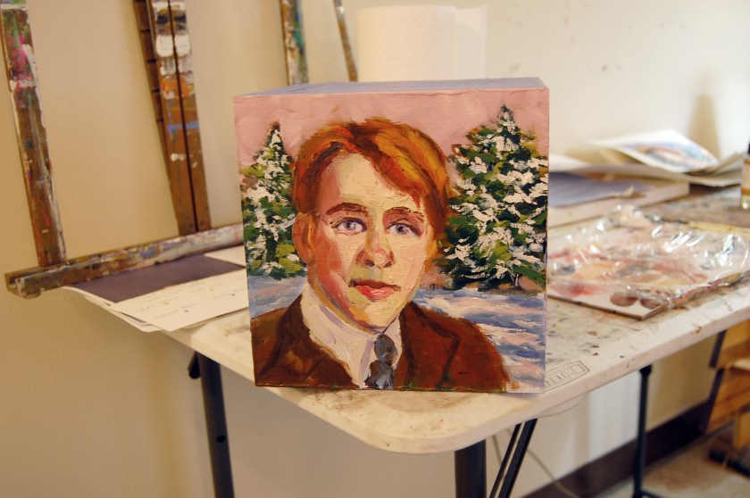
Here is a self-portrait I painted during my years as an art student at McDaniel College. Let Your Soul Be Your Pilot, 2005, Jodie Schmidt, Oil.

Self-Portrait, Oil on Canvas, 2005, Jodie Schmidt.

Self-Portrait with Red Shirt, 2004, Jodie Schmidt, oil.

 http://www.theartistsgalleryfrederick.com/march-2018-box-show.